Waterfall Presentation Templates PPT Slides Designs


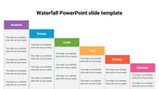

Presentation of a Beautiful Waterfall Design
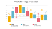
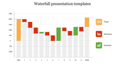
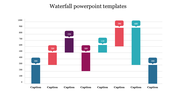
The waterfall chart is a classic example of how gradually introduced positive and negative values can have an overall effect. Because the chart was created using a traditional stacked column chart, any PPT user can edit it using values from an excel spreadsheet. A well-organized and professional display that will appeal to any audience may be swiftly created using the waterfall diagram by quickly filling in the numbers. Thanks to the Data-Driven Waterfall Chart design, your business flow can be built using these multi-color charts. To give your exhibit a polished build, use them.
Features of the Template
- 100% customizable slides and easy to download.
- Slides are available in different nodes & colors.
- The slide contained 16:9 and 4:3 formats.
- Easy to change the slide colors quickly.
- Well-designed Template with a download option.
- Excellent waterfall presentation Template.
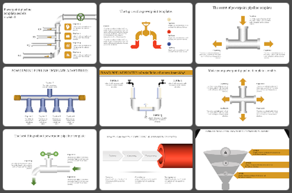


You May Also Like These PowerPoint Templates

Add to Wishlist
Download
AI Customize

Add to Wishlist
Download
AI Customize

Add to Wishlist
Download
AI Customize

Add to Wishlist
Download
AI Customize

Add to Wishlist
Download
AI Customize

Add to Wishlist
Download
AI Customize

Add to Wishlist
Download
AI Customize

Add to Wishlist
Download
AI Customize

Add to Wishlist
Download
AI Customize

Add to Wishlist
Download
AI Customize

Add to Wishlist
Download
AI Customize

Add to Wishlist
Download
AI Customize

Add to Wishlist
Download
AI Customize

Add to Wishlist
Download
AI Customize

Add to Wishlist
Download
AI Customize

Add to Wishlist
Download
AI Customize


Add to Wishlist
Download
AI Customize

Add to Wishlist
Download
AI Customize
