Waffle Chart PPT Template Free Download Google Slide


Waffle Chart Presentation Slide
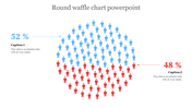
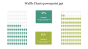
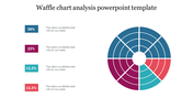
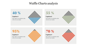
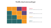
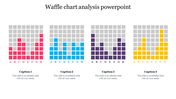
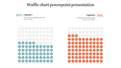
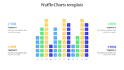
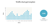
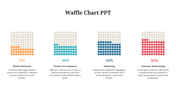
Want to sweeten up your data visualization game? A Waffle Chart is a deliciously effective way to present data, with a grid of small squares that can be filled to represent percentages or proportions. We have this template with waffle chart design that simplifies complex data, with a customizable grid of squares that can be filled with colors or icons, helping to convey key insights. It makes it easy for audiences to interpret and remember the information. Try our slide and see how it can benefit you!
Features of the template
- 100% customizable slides and easy to download.
- Slides are available in different colors
- The slide has 4:3 and 16:9 formats.
- Easy to change the slide colors quickly.
- Appealing presentation to impress an audience.
- Create feature-rich slide presentations.
- Slides are compatible with Google slides.
- Colorful waffle chart design.


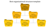
You May Also Like These PowerPoint Templates
Add to Wishlist
Download
AI Customize

Add to Wishlist
Download
AI Customize

Add to Wishlist
Download
AI Customize

Add to Wishlist
Download
AI Customize

Add to Wishlist
Download
AI Customize

Add to Wishlist
Download
AI Customize

Add to Wishlist
Download
AI Customize

Add to Wishlist
Download
AI Customize

Add to Wishlist
Download
AI Customize

Add to Wishlist
Download
AI Customize

Add to Wishlist
Download
AI Customize

Add to Wishlist
Download
AI Customize

Add to Wishlist
Download
AI Customize

Add to Wishlist
Download
AI Customize

Add to Wishlist
Download
AI Customize


Add to Wishlist
Download
AI Customize

Add to Wishlist
Download
AI Customize


Add to Wishlist
Download
AI Customize
