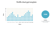
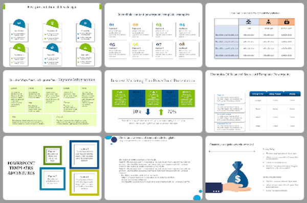
Download ravishing Round Waffle Charts PowerPoint Template


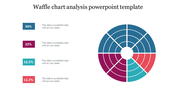
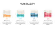

Best Waffle Charts Presentation With Circle Theme
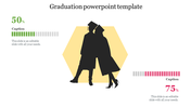
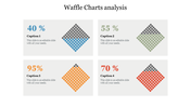
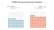
If you want to compare population or political data in a circle, Waffle Charts PowerPoint is the better way to achieve your goal. The PowerPoint has two captions with blue and red shades. Due to the different shades, the audience can easily compare the data and understand your points. If you compare it with a pie chart, the waffle chart is much easier to understand by the audience. We won't limit you when it comes to customization. Download it and change all the elements to blend with your content.
Features of the template
- 100 % customizable slides and easy to download.
- Slides are available in different nodes & colors.
- The slide contained 16:9 and 4:3 formats.
- Easy to change the slide colors quickly.
- It is a well-crafted template with an instant download facility.
- It is designed with an education theme design.
- Best waffle chart for product presentation.
You May Also Like These PowerPoint Templates
Add to Wishlist
Download
AI Customize

Add to Wishlist
Download
AI Customize

Add to Wishlist
Download
AI Customize

Add to Wishlist
Download
AI Customize

Add to Wishlist
Download
AI Customize

Add to Wishlist
Download
AI Customize

Add to Wishlist
Download
AI Customize

Add to Wishlist
Download
AI Customize

Add to Wishlist
Download
AI Customize

Add to Wishlist
Download
AI Customize

Add to Wishlist
Download
AI Customize

Add to Wishlist
Download
AI Customize

Add to Wishlist
Download
AI Customize

Add to Wishlist
Download
AI Customize

Add to Wishlist
Download
AI Customize


Add to Wishlist
Download
AI Customize

Add to Wishlist
Download
AI Customize


Add to Wishlist
Download
AI Customize
