Infographic Presentation PPT for Data Visualization

Infographics Presentation Template
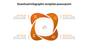
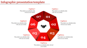
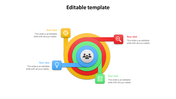
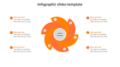
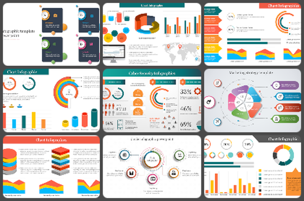
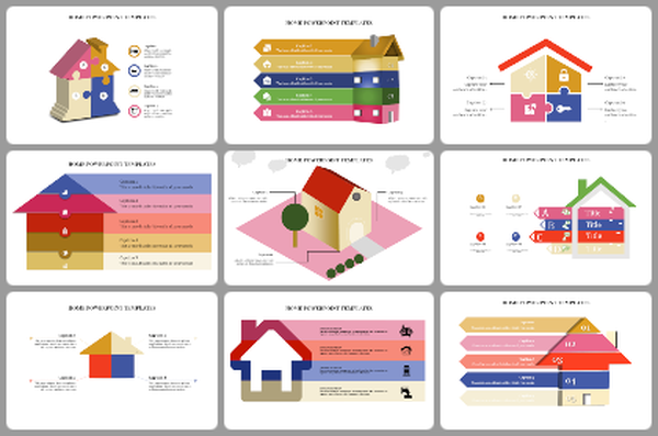
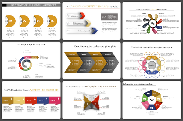
In today's data-rich world, it's super important to grab people's attention and explain things clearly. This infographics PowerPoint presentation is a great example! It has four circles all linked together. You can change the colors and words to fit whatever you want to explain—like a plan with four steps, important numbers, or a cycle. Anyone who wants to make cool presentations, like pros, teachers, students, or anyone really, can use this. Infographics are used to show research results, explain scientific ideas, and make data easier to understand for more people. Just change the colors, words, and pictures to match what you're talking about. It makes hard stuff simple and helps people get what you're saying. Grab this slide from PowerPoint and Google Slides and see how fun it can be!
Features of the template:
- Slides are available in different nodes & colors.
- Easy to change the slide colors.
- Well-crafted template with instant download.
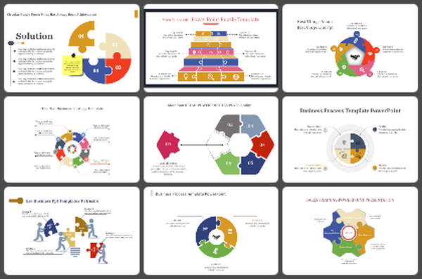
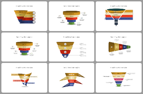
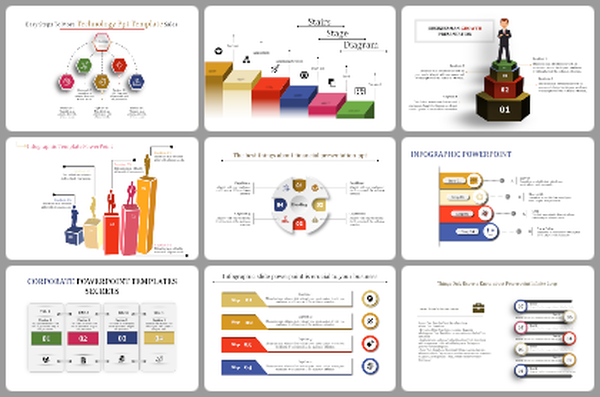
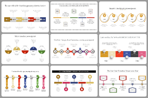
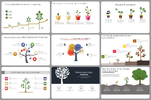
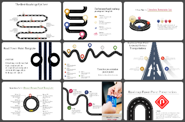
You May Also Like These PowerPoint Templates

Add to Wishlist
Download
AI Customize

Add to Wishlist
Download
AI Customize

Add to Wishlist
Download
AI Customize

Add to Wishlist
Download
AI Customize

Add to Wishlist
Download
AI Customize


Add to Wishlist
Download
AI Customize

Add to Wishlist
Download
AI Customize


Free
Add to Wishlist
Download
AI Customize

Add to Wishlist
Download
AI Customize


Add to Wishlist
Download
AI Customize

Add to Wishlist
Download
AI Customize

Add to Wishlist
Download
AI Customize

