Customized Executive Dashboard PPT Template Slide Design

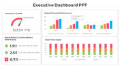
Summary of Executive Dashboard PPT Presentation
Executive Dashboard PPT presentation is a document that you will use to communicate with your clients. This format has been created to have the highest possible level of efficiency in creating your marketing campaign. It is a certain way for you to attract potential clients and make them feel comfortable about calling you as their future business partner. Executive Dashboard PPT presentation usually includes the introduction, summary, questions, and answers, then the purpose. The summary is essential because it gives a brief overview of the purpose of the presentation. This summary will contain the primary and secondary objectives of the business. Then the summary will contain the introduction and a conclusion. This summary will answer the questions and give answers to the issues that were asked in the session. After this, the summary will conclude by explaining how the clients can get the information they need through the presentation. Then the summary answers the questions that were asked during the session.
This question will contain the following questions: When should I call? What should I say? What should I do? The summary will answer these questions with the following answers: Call your clients when they ask you about your company. Then provide answers to the questions you were asked. Do not speak in front of people. You must listen to their questions to get an idea of what they want. This summary will also answer the goals of the presentation. The key point of this purpose section is to communicate to your potential customers that you know what you are doing, and you want to continue doing it. The summary will help you attract your clients to you and make them feel that they can trust you. The summary is a good way to remind people about the benefits of joining your company. The summary is also an excellent way to explain why people should join your company, so they feel comfortable about doing so. Finally, the summary will answer the final question that was asked during the session. The answer will include the following answer: Sign them up for more than one free copy of your plan. The summary will end by explaining that you will get back to them in two days to discuss their needs and interests.


You May Also Like These PowerPoint Templates

Add to Wishlist
Download
AI Customize

Add to Wishlist
Download
AI Customize


Add to Wishlist
Download
AI Customize


Add to Wishlist
Download
AI Customize

Add to Wishlist
Download
AI Customize

Add to Wishlist
Download
AI Customize

Add to Wishlist
Download
AI Customize

Add to Wishlist
Download
AI Customize

Add to Wishlist
Download
AI Customize


Free
Add to Wishlist
Download
AI Customize

Add to Wishlist
Download
AI Customize

Free
Add to Wishlist
Download
AI Customize


Add to Wishlist
Download
AI Customize

Add to Wishlist
Download
AI Customize
