Effective Ways To Analysis PowerPoint With Three Node
Data Analysis PowerPoint Template and Google Slides
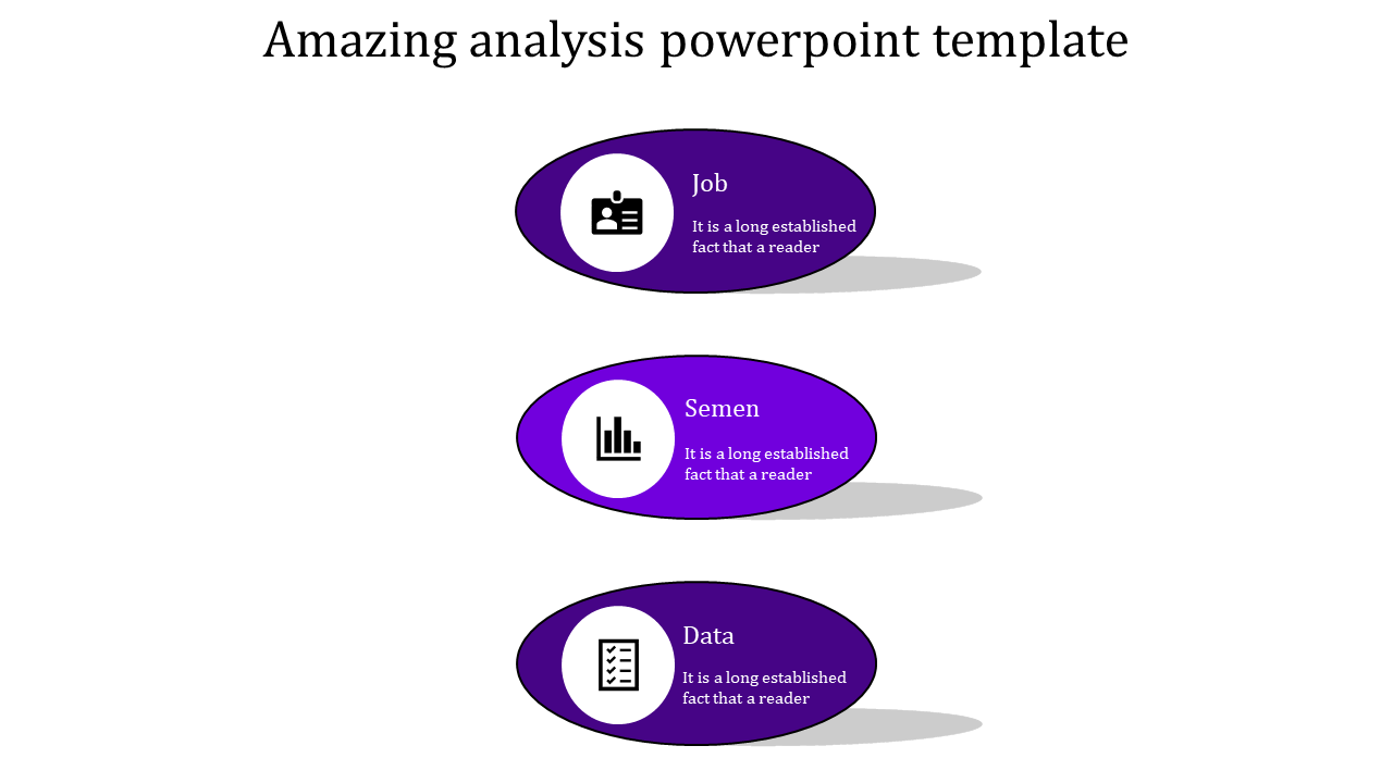
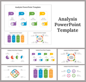
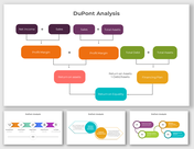
Utilizing a professional violet-shaded oval design with three nodes can transform your data analysis presentation into a compelling narrative. This layout not only captures attention but also ensures clarity and professionalism, essential for business presentations. Creating an effective PowerPoint presentation requires not just compelling content but also a visually appealing design. Here are some key tips for analyzing and presenting data effectively using this design:
- Highlight Key Insights: Use each of the three nodes to focus on major findings, trends, or critical data points.
- Visual Consistency: Maintain uniform colors and fonts to enhance readability and aesthetic appeal.
- Simplify Complex Data: Break down intricate data into digestible visuals using charts, graphs, or infographics.
- Engage Your Audience: Incorporate interactive elements or questions to keep your audience engaged and involved.
By leveraging a violet-themed oval design with three nodes, your data analysis PowerPoint template can become a powerful tool in delivering clear and impactful business presentations.
Features of the template
- 100% customizable slides and easy to download.
- Slides are available in different nodes & colors.
- The slide contains 16:9 and 4:3 formats.
- Easy to change the colors of the slide quickly.
- Well-crafted template with an instant download facility.
