Check out this Divine Diagram Chart Design slide presentation

Diagram chart PPT slide featuring a colorful arc with labeled sections and percentages, illustrating data distribution.
P.ID : 47548
    159 views
    29 Downloads
    Get Custom Slides by Experts
    Instantly Access Templates in PowerPoint

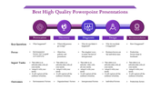
    Creative Chart Design PowerPoint Template with Four Nodes

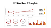
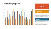
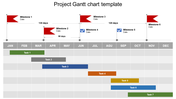
    Sometimes we have the question, what is the purpose of charts in PowerPoint? Charts help to show the data more effectively and understandable than the raw data. Download our Diagram Chart Template to present your business status or reports in four steps to an audience. The chart with a curved design in this slide allows you to add detailed information with a percentage level to ensure your audience gets your concept. Also, each bar has a different shade to avoid confusion among your audience. Of course, you can edit or change all the icons, captions, and illustrations to blend with your concepts.

    Features of the Template

    • 100 % customizable slides and easy to download
    • Slides are available in different nodes & colors.
    • This PowerPoint has four nodes.
    • The slide contained 16:9 and 4:3 formats.
    • Easy to change the slide colors quickly.
    • It is a well-crafted template with an instant download facility.
    • It is designed with a stunning theme design.
    • It comes in a colorful chart theme.
    Advertisement

    You May Also Like These PowerPoint Templates

    Free
    Add to Wishlist
    Download
    AI Customize
    Company Annual Report PowerPoint Presentation & Google Slide
    Free
    Add to Wishlist
    Download
    AI Customize
    Gantt Chart PowerPoint Templates and Google Slides Themes
    Free
    Add to Wishlist
    Download
    AI Customize
    Slide with multiple dashboard elements including bar charts, line charts, pie charts, and progress meters in various colors.
    Free
    Add to Wishlist
    Download
    AI Customize
    KPI PowerPoint slide with line, bar, pie, and horizontal bar charts, each showing different business data metrics.
    Free
    Add to Wishlist
    Download
    AI Customize
    Multi-color pie chart slide deck showing data segments in various shades, each section labelled for visual comparison.
    Free
    Add to Wishlist
    Download
    AI Customize
    Free Dashboard Templates For PowerPoint & Google Slides
    Add to Wishlist
    Download
    AI Customize
    Brand perception map illustrating consumer views on six brand tastes and natural qualities, with color coded labels.
    Add to Wishlist
    Download
    AI Customize
    A color-coded pie chart illustrating four data segments with values 15%, 20%, 30%, and 35%, paired with text captions.
    Add to Wishlist
    Download
    AI Customize
    Dashboard slide displaying data through colorful bar charts, a pie chart, and a project timeline with phase completions.
    Add to Wishlist
    Download
    AI Customize
    Three-section KWL chart with bold headings in orange, pink, and purple columns, each containing placeholder text.
    Add to Wishlist
    Download
    AI Customize
    Butterfly chart with mirrored orange bars on either side, aligned symmetrically, and reducing in size towards the center.
    Add to Wishlist
    Download
    AI Customize
    Comprehensive KPI dashboard slide with performance indicators visualized through charts and graphs for business tracking.
    Free
    Add to Wishlist
    Download
    AI Customize
    KPI dashboard slide showcasing various business metrics through colorful bar charts, pie charts, and a gauge meter.
    Add to Wishlist
    Download
    AI Customize
    Editable KPI Format PowerPoint And Google Slides Template
    Add to Wishlist
    Download
    AI Customize
    Smart chart template slide showing bar and line charts labeled net profit alongside numbered caption area.
    Add to Wishlist
    Download
    AI Customize
    A bubble chart slide with four quadrants featuring colorful icons for key business strategies with a placeholder text area.
    Add to Wishlist
    Download
    AI Customize
    SmartArt pie chart showing 65% in red and 35% in green as a and b, with placeholder captions and a text box.