Did you ever present a PowerPoint presentation and felt something lagging or not in the room? It sometimes happens since basic presentations are not working anymore.
Though PowerPoint has been the most popular tool for presentation for three decades, we are still stuck offering the best presentation. However, we can neither blame the tool nor our working skills.
We might have presented many presentations and sat down to listen to an n number of presentations, but we can remember only a few. Some are suitable approaches, and some may need to be more. It is all about how we evolve ourselves and produce exciting content according to the current trend that pushes the audience to listen.
Internet today offers us a lot of ideas, great techniques, and a wide range of images and videos to make things better, but often we are forced to make the same old-school techniques with complex texts and unclear photos.
Here are five tips and tricks to not make your presentation look monotonous.
1. Who Is Your Audience?
Whatever work you do, the result depends purely on whom it reaches. It may be any field of work, your niche, or content. You should be aware of what your audience wants to hear and see from your presentation. For instance, humorous presentations can interest a group of students; on the other hand, when it comes to business clients, it does not work, and things collapse. Hence knowing your audience is critical. When you know your audience, half of your work is already done, and you can move with the other criteria even smoother.
2. Slide Organization
Inspirational ideas for slide content sometimes emerge in a sensible order, even for presentation. Audience retention is improved by having sub-topic chunks within your presentation so try to bring slides together in mini-segments. Once you’ve written your main slides, use the slide sorter (View Menu > Slide Sorter) to put the slides in an order that fits the overall story of your presentation.
3. Color And Font Matter
Your text should be simple to read and excellent to look at. Large, simple fonts and colored themes are always your best companion. The best fonts and colors can vary based on your presentation setting. Are you presenting in a large room? Make your text more prominent than usual, ensuring the audience in the back can also read it. When you are presenting, turning every light on, the dark text is your best bet for visibility.
4. Never Overload
Overfeeding is always dangerous. Make sure your slide count is limited (not more than 20 slides) so that it will not bore the audience as well as you. Also, it is better to ensure that every slide has fewer sentences, making the slide look manageable.
5. Custom-made Templates
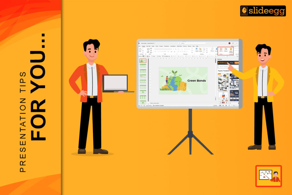
Tailoring your presentations according to your audience’s expectations is really important. Sticking to your typical standard blank PowerPoint presentations will not work anymore. Many of us think customizing our templates is a time-consuming and tedious process. No, it is not with Slide Egg anymore. Slide Egg offers plenty of free PowerPoint templates where you can edit your needs and make your presentation interesting.
Conclusion
Slide Egg also has plenty of options for designing your ideas into templates. You can directly log in to the website and redesign your needs with the help of the best designers from Slide Egg.
PowerPoint presentations are no rocket science to learn. The Internet is vast, and with the help of Slide Egg, you can take your typical presentations to the next level and be more engaging at the same time.


