Have you ever looked at a bunch of numbers and thought, “Isn’t there an easier and better way to show this?” These days, there’s so much data around us that even important information can get overlooked if it’s not shown clearly.
Think of charts as a translator for your data. They articulate the complicated details into easy-to-grasp pictures. Well, it will be challenging with so many options to find the ideal one. Let’s dive deep into one of the top chart PowerPoint templates that helps make your data stand out.
The Power of Smart Chart Selection
The right chart isn’t just about making things pretty – it’s about crystal-clear communication. The perfect chart helps your audience spot patterns and trends in seconds, while a mismatched one might leave them scratching their heads.
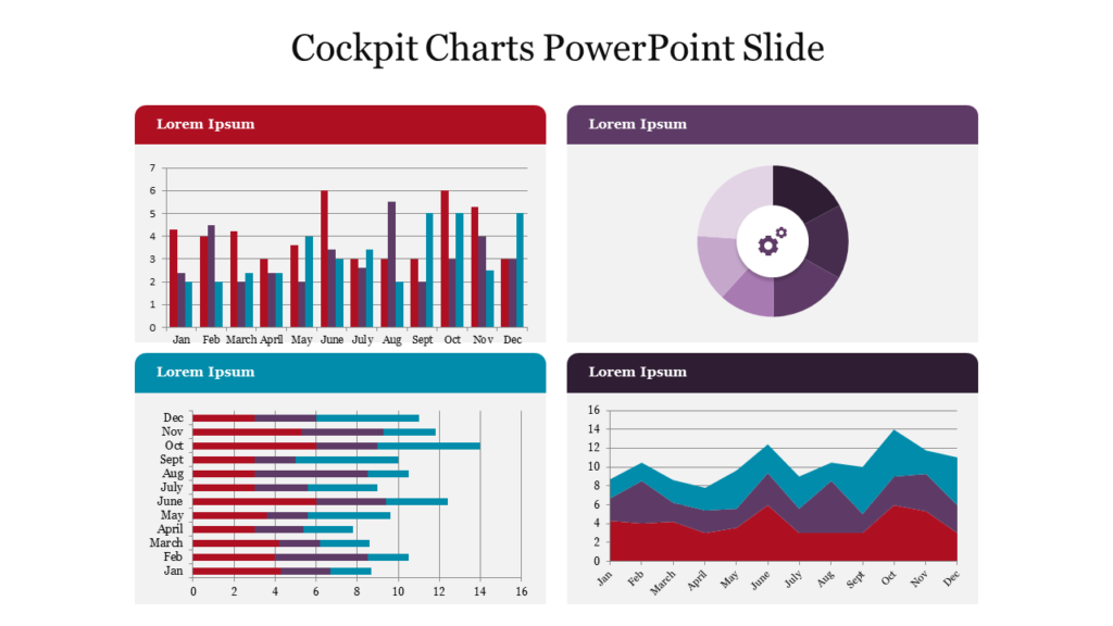
Here’s why getting it right is crucial:
- Clarity: The right chart highlights the most important aspects of your data.
- Engagement: Visually appealing charts keep your audience interested.
- Impact: A clear chart makes your message more memorable.
By understanding types of charts and graphs, you can align your visuals with your goals.
Understanding Chart Types for Data Presentation
Not all data is created equal, and neither are charts. Let’s explore common chart types for data presentation and when to use them.
Bar Charts
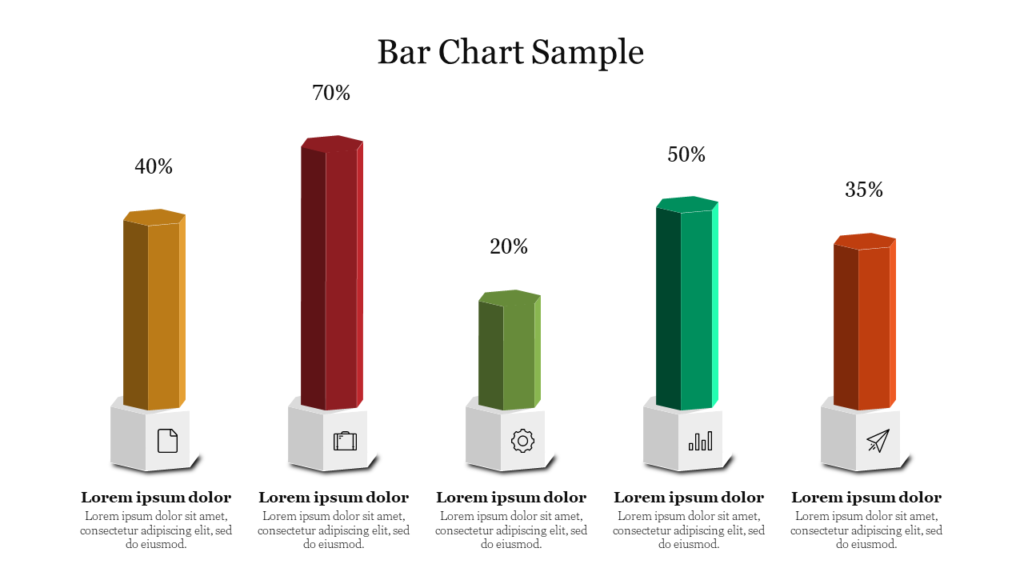
Bar charts are perfect for comparing categories. Whether you’re analyzing sales across regions or survey results, bar charts make comparisons clear and impactful.
- Best For: Comparing discrete categories.
- Example: Showing monthly revenue by product line.
- Tip: Use horizontal bars for long category names to keep things tidy.
Line Graphs
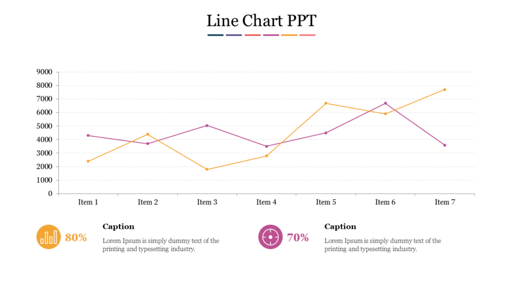
These are your best friends when showing how things change over time. Perfect for revealing trends, whether you’re tracking sales growth or market fluctuations.
- Best For: Visualizing changes over time.
- Example: Tracking website traffic over the past year.
- Tip: Keep the design simple to focus on the trend. Avoid cluttering with multiple lines unless necessary.
Pie Charts
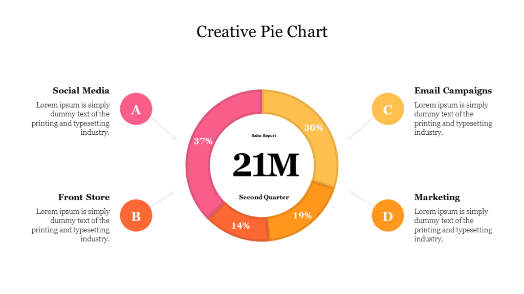
While they’re popular for showing parts of a whole, use them wisely and sparingly. They work best with a limited number of categories.
- Best For: Displaying proportions or percentages.
- Example: Breaking down market share by company.
- Tip: Limit to 4-6 slices for clarity. If you have too many categories, consider a bar chart instead.
Scatter Plots
Want to see how two factors might be connected? Scatter plots excel at revealing relationships between variables, helping you spot patterns or correlations.
- Best For: Highlighting relationships between variables.
- Example: Comparing advertising spending to sales growth.
- Tip: Use when you want to show clustering or outliers in your data.
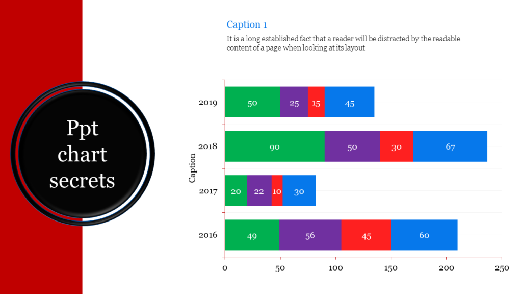
Stacked Bar Charts
Stacked bar charts allow you to compare parts of a whole across categories. They’re great for showing both the total and the contribution of individual components.
- Best For: Comparing parts within a category.
- Example: Displaying the breakdown of total sales by product category and region.
- Tip: Keep colors distinct to differentiate sections.
How to Choose the Best Chart Type
Your chart choice should flow naturally from the story in your data. Consider these key factors:
Step 1: Understand Your Data
Before anything else, get to know your data. Ask yourself:
- Is it categorical or numerical?
- Are you showing relationships, comparisons, or trends?
- Do you want to highlight a single key point or a broader overview?
Step 2: Define Your Purpose
What do you want your audience to take away from the chart? If your goal is to compare, consider bar charts or stacked charts. For trends, line graphs work best.
Step 3: Match the Chart to the Data
Here’s a quick guide to choosing the right graph based on data:
- Comparisons: Bar charts, stacked bar charts.
- Trends Over Time: Line graphs.
- Relationships: Scatter plots.
- Proportions: Pie charts, donut charts.
Step 4: Consider Your Audience
Not all audiences are comfortable interpreting complex charts. For beginners, stick to simple visuals like bar charts. For more experienced audiences, you can explore advanced data analysis charts like scatter plots or heat maps.
Data Visualization Best Practices
The real magic happens when your chart instantly clicks with viewers. Here are proven strategies to make your data more digestible:
Keep It Simple
Don’t overwhelm your audience with too much data. Highlight the most important information.
Use Color Wisely
Colors can emphasize key points but should be used sparingly. Avoid overly bright or clashing colors.
Label Clearly
Make sure all axes, legends, and data points are labeled for clarity.
Leverage Tools
Use data presentation software like PowerPoint, Excel, or Google Sheets to customize your charts and align them with your theme.
Tell a Story
Great charts are part of a narrative. Use them to support your key points, not replace them.
Common Mistakes to Avoid
Even the best chart types for data presentation can fail if used incorrectly. Avoid these pitfalls:
- Overcomplicating the Design: Simplicity is key. Avoid adding unnecessary elements.
- Using the Wrong Chart Type: Ensure the chart matches your data and purpose.
- Ignoring Accessibility: Use high-contrast colors and clear fonts to make charts accessible to everyone.
Choosing the Right Chart for Different Data Sets
Here’s a quick cheat sheet for choosing the right chart based on your data set:
- Sales by Category: Bar chart or pie chart.
- Monthly Performance Trends: Line graph.
- Demographic Breakdown: Stacked bar chart or pie chart.
- Relationship Analysis: Scatter plot.
Data Presentation Tips for Beginners
If you’re new to creating charts, don’t worry! Here are some data presentation tips for beginners:
- Start simple—choose basic chart types like bar or line graphs.
- Use templates like PowerPoint presentation slides, or Google Sheets.
- Focus on the message you want to convey rather than the design alone.
How to Make Data More Understandable with Charts
The ultimate goal of any chart is to make data understandable. To achieve this:
- Organize your data logically.
- Use charts to highlight key points.
- Combine charts with text or visuals for added context.
Final Thoughts
Finding the right chart is like picking the right tool. If you know what your data is trying to say, what your audience wants or needs, and what you want to achieve with your presentation, you’ll craft visuals that will inspire and not just inform. Whether you’re pitching to executives or sharing insights with colleagues, these visualization techniques will help your message land.
Ready to revolutionize your next presentation? Start experimenting with different chart presentation template today and watch your data come to life!


