
Confused about why problems keep recurring? Find out how 5 Whys infographics can help you get to the bottom of it.
What is the 5 Whys Method?
The 5 Whys is extremely simple. The foundation of this problem-solving technique allows you to find and expose a root cause for any problem by asking consecutive “Why?” questions five times, it appears. Every question moves you deeper into your problem, and then you come across the real hidden cause that is underlined for your difficulty and is not easily discernible at first glance. The Why Why Analysis Format PPT helps to make effective decision-making work.
Why Use Infographics to Present 5 Whys?
Infographics are a visual means of making data easier to understand and remember. 5 Whys presentation makes the problem-solving process even more interesting and accessible to your audience, as follows:
It breaks down the complexity of problems into simpler steps. It becomes easy to follow the progression from the problem that you have through to the ultimate root cause. The teams view each step flowing into the next for clarity in decision-making.
Since “Seeing is Believing.” Studies show that people remember 80% of what they see and do, whereas only 20% remember, what they read. The infographics help pass on the information well as it include texts with visuals, making the 5 Whys method memorably applicable for everyone concerned.
A properly structured 5 Whys infographic can identify the problem, outline the causes, and suggest solutions within just a few minutes, hence enabling teams to make decisions much faster.
How Does a 5 Why Template PPT Work?
Here’s a step-by-step breakdown of how a 5 Whys infographics presentation works in real life:
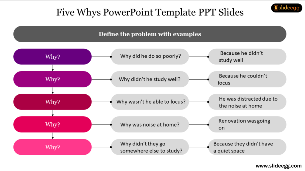
Define the Problem
The most important thing is to make clear what needs to be addressed. That is the central beginning of the presentation. In an infographic, this may often go at the top, sometimes as an icon or an image representing the issue itself.
For example, if the topic is “Late Project Deliveries,” the presentation will open with that very statement and support it with pictures of a project calendar or a clock highlighted.
Ask “Why?” Five Times
The five “Why?” questions make up the core of the presentation. Each answer rolls up from the previous one into itself, meaning that you eventually get closer to the root of the problem. In an infographic, sometimes this will be represented by a flowchart infographics or tree diagram, where the arrows follow one “why” to the next.
Here is how this process might look visually:
Why 1: Why was the project delivered late?
Answer: The team ran out of time.
(Visual: A clock with a moving hand.)
Why 2: Why did the team run out of time?
Answer: Because they had too many things to do.
(Visual: Checklist containing too many tasks.)
Why 3: Why were there so many things to do?
Answer: Because the initial plan was inaccurate.
(Visual: Planning chart.)
Why 4: Why was the plan inaccurate?
Answer: Because there was poor communication among team members.
(Vision: A broken communication line.)
Why 5: Why was there a communication breakdown?
Answer: There wasn’t a designated point of contact.
(Vision: A question mark above a head.)
Visible Data and Insights
If relevant, stats could be added to expand on the problem and solution. For instance, if a determination was made that lack of clear communication was the root cause, then add stats such as “86 % of employees and executives cite poor communication as the cause of workplace failures”, which further adds strength to the point visually with real-world evidence.
Stressing The Root Cause
You then ask “Why?” five times, after which it should be underlined why there is the root cause. Use bold to tell people what the main issue is. The last portion of the presentation might also include suggested solutions and next steps to solve this problem.
Summary and Key Actionable Steps
Summarize the root cause and propose a solution in your conclusion. A comprehensive checklist of next steps will readily enable teams to take action immediately on the findings.
Why 5 Whys Infographics Are Such a Great Success
Many advantages arise from using a presentation of 5 Whys infographics:
Better Decisions: The use of visuals in outlining the problem and causes has allowed teams to make better decisions. Instead of just dealing with symptoms, they now focus on the root causes, making solutions more sustainable.
Better Collaboration: The infographics create a common understanding of the problem among members, allowing teamwork to interact with solving the problem. Members can see one flow of visuals and can contribute to the discussion.
More Engaging: Presentations involving infographics are much more engaging, keeping the minds of the people focused on what needs to be solved.
Conclusion
It is even more impactful when used together with infographics in a presentation. That is where 5 Whys can enable teams to simplify difficult problems, improve collaboration, and make better-informed decisions. In elevating your problem-solving process, using 5 Whys infographics presentations may be your next step!