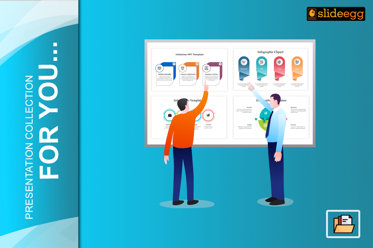
In the current fast-paced data-presentation scene, infographics have become vital tools for displaying detailed information in an appealing visual format. With the growing evolution of design preferences, keeping in mind the recent trends concerning infographic presentation can make all your visuals appealing and effective.
In this blog, we will either explore the current free infographic templates trends or share some insight on how to use these trend as inspiration for creating a useful infographics templates.
Implementing Minimalism
Minimalistic design remains a popular format in the slide infographics trends. Aesthetic minimalism: keep your elements as simple and clean, using few lines of information to provide enough white space in contrast with the restrained color palettes. It also helps to maintain clarity in the message and avoid a messy visual.
Design Tip: Keep a lot of open whitespace in general with your minimalist infographic template, and simplify to just content such as icons or typography. But web designers can Colorize the formats themselves, provided they choose the right color palette. This is to make it more easier for the readers and listeners of your article to absorb (grok) the core idea without getting lost.
Advanced Data Visualization
Trend Summary: Using more advanced data visualization methods becomes very important only when the complexity of the available data increases. Interactive charts, graphs and diagrams are often better at distilling complicated data sets into larger patterns.
Design Tip: Include attention-grabbing visuals in your infographics However, the charts and graphs must not only be beautiful but also need to correctly reflect your data. Ensure those visual elements were simple and straightforward that makes the whole piece easy to understand or presented.
Interactive Infographics Slides
Trend Overview: Interactive infographics slide are on the rise because they engage the viewer more. Interactive infographics allow them to click on sections, zoom in, or hover to learn more about any specific part. Creating interactive ones can make your viewers more engaged.
Design Tip: When creating interactive infographic PowerPoint templates make sure to consider the user. You might want to make it where you can click or highlight different points, or have sub-sections you can expand and close. Make sure it is simple to use and seamless, though; the goal is to teach them more about the data, not distract them.
Custom Illustrations and Icons
Trend Overview: Custom illustrations and icons are becoming increasingly popular. This eliminates traditional stock photos and images for a unique brand.
Design Tip: Make custom images that match your brand’s theme and message. This will ensure that not only do your infographics stand out from others but that your brand appears seamless across all PPTs. Consider canva to design small icons or pictures that will hit target audience.
Bold Typography
Trend Overview: Beyond just an element with words, typography is making big bold to grab attention and draw viewer eyes.
Design Tip: Use thick, bold fonts for headlines, critical pieces of information, and other items you want your reader to pay attention to. Use less important details as a patterned font. Do not use too many fonts.
Asymmetrical Layouts
Trend Overview: Asymmetrical layouts are fonts and sizes. Using different sizes and different shapes is becoming popular.
Design Tip: Add depth in your infographic templates by exploring asymmetrical designs to create visual appeal. Employ a well-designed but dynamic layout of different sized, angled and positioned texts along with images. Ensure that the design communicates well, and is cohesive despite lacking symmetry.
Infographic Animation Video Presentation
Trend Summary: With the addition of basic animation and motion graphics, infographics are now being brought to life using movement in a way that can make data more dynamic/sticky. It is especially useful by the mean of design and animated infographic ppt, It helps to turn a slide show into an interactive adventure for your audience in the digital formats, where movement can catch attention faster than their stationary brethren.
Design Tip: Building smooth, intentional animations into your infographic templates to emphasize data points or transitions. Animations: Utilize tools like Adobe After Effects or online animation platforms to generate animations that augment and highlight the data visualization.
Microlearning Infographics
One-sentence summary: Presenting information into smaller, easily digestible segments is trending with microlearning. Microlearning infographics make sure to keep content neat and tidy so they do not lose their mojo when consumed by the audience.
Design Tip: Create modular Infographic Slide Templates (with easily identifiable sections) Present each point of information: with as little text and in clear visuals This allows you to understand in smaller pieces which leads to better learning as well optimal retention.
Eco-Friendly Design Practices
Trend Overview: There is a greater sense of Environmentalism being had now where the sustainable design practices are also trending. Infographic Design — It should be Eco Friendly: This is the design which focuses to use minimum resources and create zero waste.
Design Tip: Whenever possible use a digital format to reduce paper waste, and if color printing is required choose palates that require less ink. Not only do sustainable design practices indicate an intention toward eco-consciousness, but they also cater to the increasingly environmentally aware tastes of consumers.
Conclusion
Design is relatively easier to change compared with content, so it’s much more timely and on-trend if you keep up to date with the visual style of infographics nowadays.
But you can make your infographics sparkle by following minimalist aesthetics, including advanced data visualizations and enabling interactive elements. Custom illustrations, strong typography and dynamic layouts offer something different whilst the use of animation provide an engagement boost in any microlearning form. And environmentally-conscious design choices as well can be tied to with sustainability.
When you apply these trends deliberately, the result will be visually pleasing as well as operational infographic templates to get your point across in a data-savvy world.


