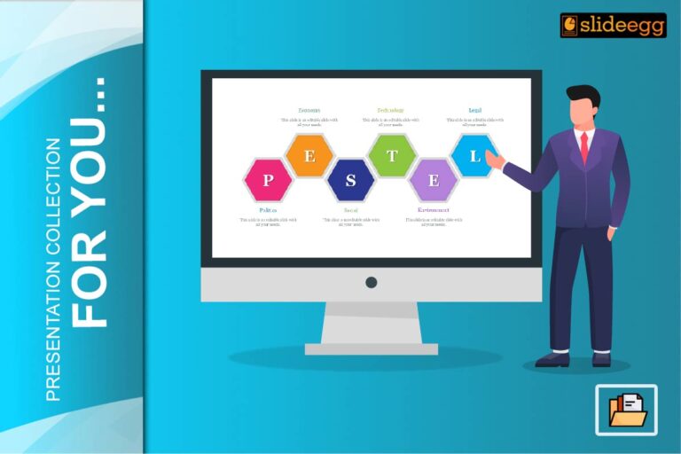
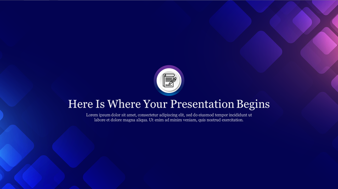
Most people think a background is just a color behind the text. But the truth is — your slide background design plays a big role in how your presentation looks and feels.
It’s easy to ignore the background and go with the default white. But if you want to stand out, impress your audience, and share your ideas clearly, then you must choose the right background design.
In this blog, let’s see why your PowerPoint background design matters and how it can make your presentation better and more powerful. Whether you’re a student, a teacher, or a business professional — this guide is for you.
What is a PowerPoint Background?
A PowerPoint background is the base layer of your slide. It can be a solid color, a picture, a gradient, or a pattern. Everything else—like text, shapes, images—sits on top of it. Think of it like a stage where all your content performs. A good background supports the message, while a poor one can confuse or distract the viewer.
Benefits of Using Backgrounds in Slides
A background is not just for decoration. It helps your audience focus, understand your message better, and stay interested. A well-chosen background can make your slide look clean, colorful, and well-organized. It also adds beauty and meaning to your content without using many words.
Why Does Background Design Matter?
Design matters because your presentation is more than just words. People remember what they see more than what they hear. A good background sets the tone of your slide—it can make your topic feel serious, fun, calm, or creative. It also makes your slides look professional, which helps you earn more trust from your audience.
1. A Good Background Brings Your Slide Elements to Life
Your slide contains text, images, icons, and sometimes charts or graphs. If you put all of them on a boring or too-bright background, nothing will stand out.
A neat and well-chosen background helps your content look clean and easy to understand. It also adds life to the slide.
Why it helps:
- It creates balance between text and images
- It avoids confusion or clutter
- It makes the slide look clean and modern
✅ Tip: Use a soft, neutral background when you have many visuals on the slide. It helps the main content stand out.
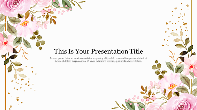
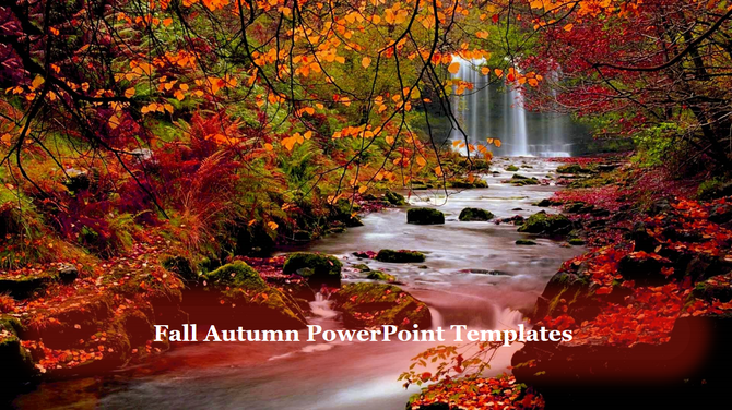
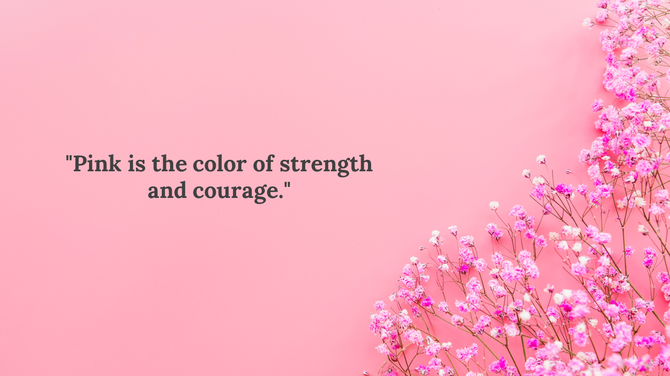
2. It Adds Texture and Feel to Your Slides
Have you ever looked at a slide that just “felt right”? That’s the power of texture. It makes your slide feel rich and real.
You don’t need to touch the screen to feel the texture — your eyes can sense it. A wall, a wooden surface, a soft paper look — these small things can bring warmth or seriousness depending on the topic.
Why it matters:
- It gives the slide a personal touch
- It adds emotion to your message
- It makes your audience connect visually
✅ Tip: Use nature backgrounds (like rain, water, leaves, or stone walls) for topics on wellness, mindfulness, or personal growth.
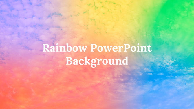
3. It Makes Your Presentation Look More Interesting
Plain white slides can look clean, but after 5–10 minutes, they feel dull. A background adds variety, especially when you switch colors or textures across different slides.
Even small changes in background design help keep your audience alert and interested.
What it improves:
- Attention from the viewers
- Memory of your message
- The energy of your talk
✅ Tip: Add light-colored backgrounds to casual presentations and darker, bold ones for serious business content.
4. It Helps Your Audience Focus on the Key Message
A well-designed background can guide your audience’s eyes to the most important part of your slide — your headline, your graph, or your image.
Smart use of background shapes or light effects can lead the eye exactly where you want it.
How it helps:
- Focuses viewer attention on the key content
- Makes complex information easier to follow
- Avoids distractions
✅ Tip: Add a subtle gradient or corner fade to pull the focus to the center of the slide.
5. It Builds a Professional and Consistent Look
In school or work, your presentation reflects you. If your slide background is messy or inconsistent, it may look like you didn’t try. But when the background is clean and matched across slides, it builds trust.
Why it’s useful:
- Gives a strong first impression
- Shows you are well-prepared
- Builds your personal or company brand
✅ Tip: Choose one design style and follow it for all your slides. Don’t mix too many colors or image styles.
Bonus Table: What Makes a Good PowerPoint Slide Background?
| Feature | Good Background | Bad Background |
| Color | Soft, matches your content | Too bright or too dark |
| Texture | Adds soft detail | Distracts or hides text |
| Readability | Clear contrast with text | Text is hard to read |
| Professional Look | Clean and aligned | Looks rushed or random |
| Focus Support | Leads eye to message | Draws attention away from message |
Who Can Benefit from a Great Background Design?
A well-designed PowerPoint background theme is useful for everyone. It doesn’t matter if you’re a student, teacher, businessperson, or public speaker — a good background makes your presentation easier to understand and more beautiful to see. It helps you share your message clearly and grab your audience’s attention.
🧑🎓 Students
If you are a student, a neat background can make your class presentation look smarter. It shows your effort and creativity in front of your classmates and teachers. It also helps your ideas stand out better.
- Makes class projects more attractive
- Helps explain your points clearly
- Shows you’ve put in good effort
👩🏫 Teachers
Teachers can use nice backgrounds to create slides that students enjoy looking at. It keeps the students interested and helps them understand lessons better. A good background also makes online classes more colorful and friendly.
- Keeps students focused during lessons
- Makes slides easy to read and follow
- Creates a friendly classroom mood
💼 Business Professionals
If you’re in a meeting, a strong background gives your slides a smart and clean look. It helps your team or clients take your message seriously. A good background also builds your professional image.
- Makes reports look neat and professional
- Builds trust with your team or clients
- Highlights important data clearly
🎤 Coaches and Public Speakers
Speakers and trainers can use background slide design to connect with the audience better. It adds emotion and style to your topic. The right background supports your message and keeps people listening.
- Adds power and emotion to your slides
- Helps audience follow your ideas
- Makes your talk look professional
Final Thoughts
Your background slide is more than just space behind your text — it’s part of the message. It supports, improves, and lifts up your content when used the right way.
Whether you’re creating a school project or a business report, take a little time to choose the right background. It’s a small change that makes a big difference.
✅ Want free background templates to try? Explore our Free PowerPoint Slides Library
Make your slides simple, clean, and strong — and your message will shine.
Frequently Asked Questions (FAQs)
1. What is the best background color for PowerPoint slides?
Soft colors like light blue, white, or grey are best for text. Avoid bright or loud backgrounds that hurt the eyes.
2. Should I use pictures as slide backgrounds?
Yes, but make sure the picture is clear and matches your topic. Always check that the text is still easy to read.
3. Can I use different backgrounds for different slides?
Yes. Just make sure all your slides still feel like one complete presentation.
4. Where can I find free PowerPoint background templates?
You can find many free background templates online. Look for websites that offer editable and easy-to-use designs.
5. How do I know if my background is too much?
If your text is hard to read or your audience is distracted, your background might be too strong. Keep it simple and soft.