
A radial chart, also known as a circular chart, is simply a fabulous way to present data in a very interesting way. It’s always awesome when you can have something that revolves around a center point and you can compare elements or show progress. So, if you are presenting through PowerPoint, just place a radial chart into your slideshow.
In this blog, we will walk you step by step through creating a radial chart in PowerPoint. Let’s get started!
Create a Radial Chart in PowerPoint: Step-by-Step
1. Open PowerPoint and Select a Blank Slide
Open PowerPoint and create a new slide. Choose the blank slide layout, which will provide you with more space for your radial chart.
2. Insert Basic Circle
Now we are going to add a circle, which is going to be the basis of our radial chart. And here is how to do that:
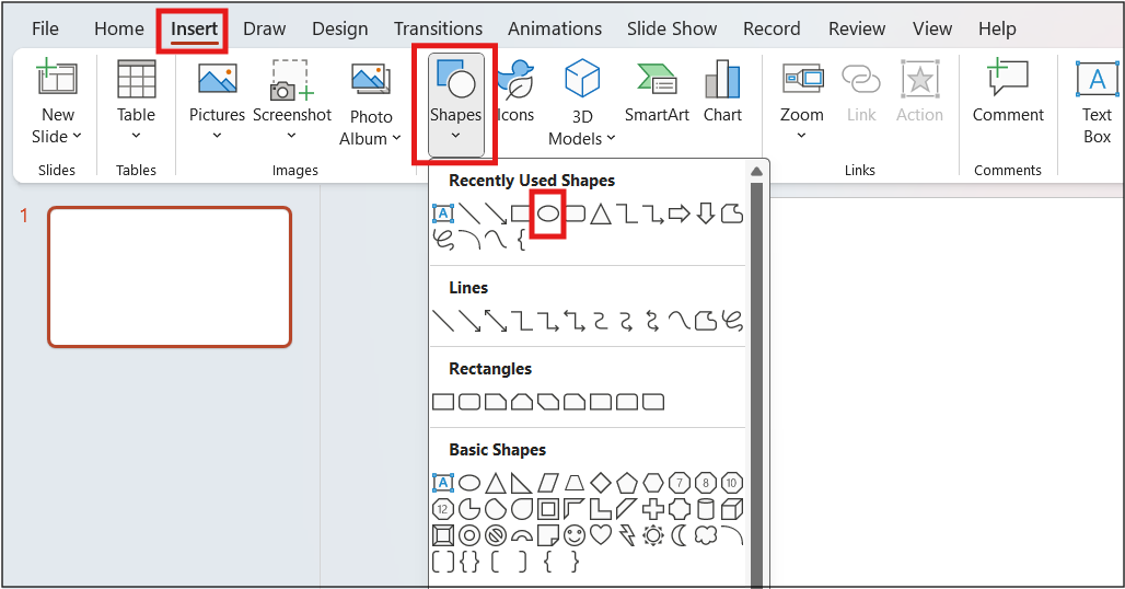
- Click on “Insert” from the menu.
- Under “Shapes”, click on the “oval”
- Create a perfect circle by pressing and holding the Shift key while drawing.
- This is the outer layer of your radial chart.
3. Add Radial Sections
- Add several sections (or “slices”) to your radial chart:
- Go to the Insert menu, and click on Shapes again.
- From the “Basic Shapes” dropdown menu select the Pie shape.
- Place your pie shape over your circle and resize.
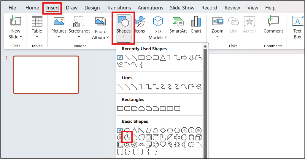
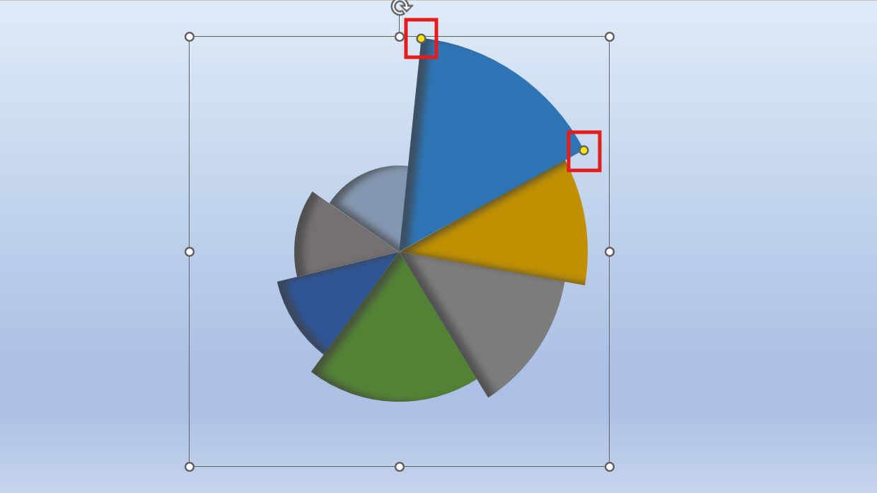
- Use the handles of your pie shape to adjust each section, and the angles between each as well. Those sections represent your data points or groups.
4. Fine-Tune Your Data
The beauty of a radial chart is that every slice represents a specific value. You can change each section by:
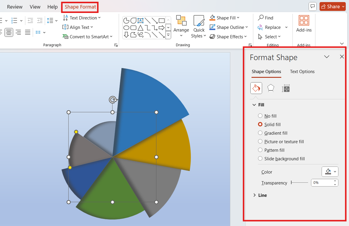
- Colors: simply click on a slice, go into the “Format” tab, and then click on “Shape Fill” to choose a different color for each category.
- Annotation: Now that you have created your pie chart, write a few words for each sector that will contain your additional information. Hold right-click on the different sectors and choose Add Text.
- For example, you can have one section as 25% and the other as 50%. You move the angles around proportionally with these percentages.

5. Central Annotation
Most radial charts have a central point that gives everything cohesion. To put it in:
- Go to Insert > Shapes and pick another circle, perhaps a tad smaller than your main one.
- Put this over your radial chart.
- Add a label inside the circle representing the central concept or title of the chart.
6. Refine Your Design
When you’ve laid in all your slices formatted, and labeled, take a minute to finalize your design.
- Align elements right.
- Make sure the colors are visually appealing and easy to read.
- You can also add a legend or alt text if you want to describe what your segment means.
If you lack much time or do not wish to go through the tedious process of starting from scratch to create the chart, there is still a glimmer of hope in utilizing available premade templates. There are a lot of websites that offer free, downloadable, and customizable radial chart templates, These can easily be downloaded and dropped right into your presentation. These save time and offer professional designs that make your presentation look nice and exciting.

Why a Radial chart in PowerPoint?
Radial charts are quite beautiful, easy to understand, and will work pretty well in PowerPoint. They are a brilliant choice for:
- Comparing data: How various categories relate to a central idea.
- Displaying progress: Showing growth or highlighting milestones, information pops out.
- They are also super helpful if you’re working on something slightly more complex presentations.
If you prefer to work with Google Slides, we have also discussed how to make a radial chart in Google Slides in another blog, which may be useful for your needs.
Conclusion
Creating a radial chart in PowerPoint has never been easier than before, especially with these steps. Actually, it will take just a few clicks to add your presentation with a real exciting ingredient. And if you are short of time, then premade templates will be your best companion. Try now!