Creating charts in PowerPoint is a powerful way to present data visually, making it easier for your audience to understand complex information. When presenting data, charts can transform numbers into visual stories that are easier to understand and remember. PowerPoint offers a variety of chart types and customization options, making it an ideal tool for creating effective visual aids. In this guide, we’ll show you how to create a chart in PowerPoint step by step.
Step-by-Step Guide to Adding a Chart in PowerPoint
Step 1: Open PowerPoint and Insert a New Slide
- Open PowerPoint and select the presentation you want to add a chart to or create a new presentation.
- Insert a new slide by clicking on the “New Slide” button in the “Home” tab.
- Choose a slide layout that includes a content placeholder (e.g., Title and Content).
Step 2: Insert a Chart
- Navigate to the “Insert” tab located in the ribbon at the top of the screen.
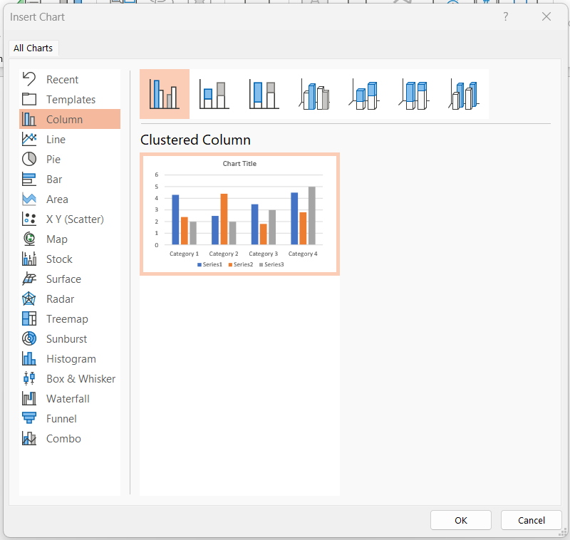
- Select “Chart” from the available options. This will open the “Insert Chart” dialog box.
- Select a chart style from the selection provided that best fits your data and style. PowerPoint offers various chart types like bar charts, line charts, pie charts, and more.
Step 3: Enter Chart Data
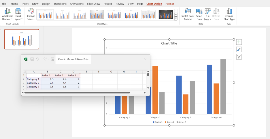
- Once you’ve selected your chart type, PowerPoint will insert a default chart on your slide and open an Excel spreadsheet window.
- Enter your data in the Excel spreadsheet. Each column and row represents different parts of your chart.
- As you input your data, the chart on your slide will update automatically.
Step 4: Customize Your Chart
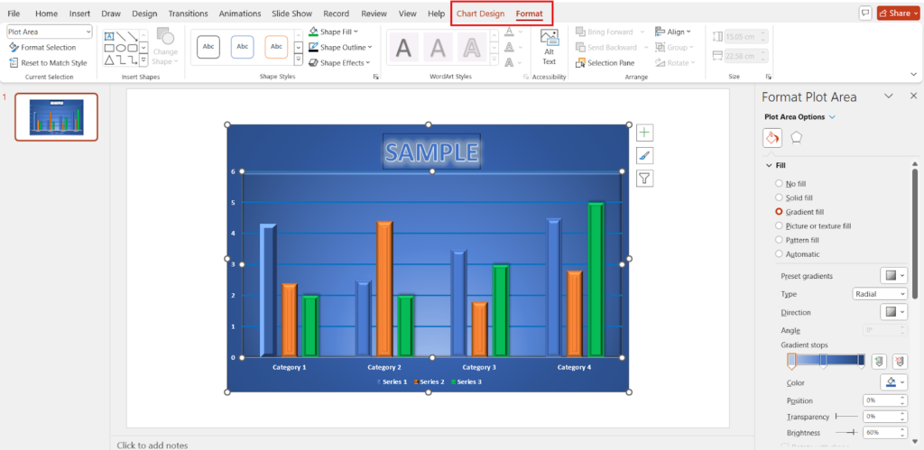
- Click on the chart to select it. This will display the “Chart Tools” in the ribbon, with two tabs: “Design” and “Format.”
- Use the “Design” tab to change the chart style, switch rows and columns, or select a different chart type.
- Use the “Format” tab to customize the appearance of your chart, such as changing colors, adding effects, or modifying fonts.
Step 5: Add Chart Elements
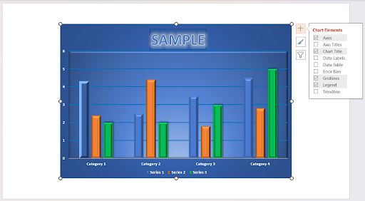
- Click on the “Chart Elements” button (a plus sign) next to your chart to add or remove chart elements like titles, data labels, and legends.
- Check the boxes for the elements you want to include in your chart. For example, add a chart title to describe what the chart represents.
Tips for Creating Effective Charts
- Choose the Right Chart Type: Different chart types are better suited for different kinds of data. For example, use a pie chart for percentage distributions and a bar chart for comparing quantities.
- Keep it Simple: Avoid overloading your chart with excessive information. Focus on key data points to ensure clarity.
- Use Colors Wisely: Use contrasting colors to differentiate data points but avoid using too many colors, which can be distracting.
- Label Clearly: Ensure all axes and data points are clearly labeled to make your chart easy to understand.
Helpful Hints
Explore Free Chart PowerPoint Templates
If you want to save time or need inspiration, try using free chart PowerPoint templates with editable charts available online. These templates offer a variety of pre-designed charts that you can customize to fit your data. Simply search for “free PowerPoint chart templates” to find numerous design options.
Learn More Presentation Hacks
Creating effective presentations involves more than just making charts. Visit our tips and tricks page to learn more presentation hacks and enhance your PowerPoint skills. From design tips to advanced features, our page offers valuable insights to help you create stunning presentations.
Conclusion
Creating charts in PowerPoint is a quick and easy process that can significantly enhance your presentations. By following these steps, you can design visually appealing and informative charts that clearly communicate your data. Don’t forget to explore free chart templates and visit our tips and tricks page for more presentation hacks. Happy charting!


