Maps can be a powerful tool to visualize data, tell stories, and engage your audience. Whether you’re showcasing sales data, planning a global project, or simply adding a visual element, a well-designed map can make your slides pop. Creating maps in PowerPoint is easier than you think. In this guide, we’ll walk you through the steps to create and format maps in PowerPoint. Plus, we’ll suggest some handy tips and tricks along the way.
Choosing the Right Map
The first step is to decide what kind of map you need. Are you looking to show global trends, highlight specific locations, or compare data across regions? PowerPoint offers a variety of map options, from basic world maps to detailed country and state maps.
Once you’ve determined your map’s purpose, you can start exploring the different map styles available. PowerPoint comes with several built-in map styles that you can customize to fit your needs. If you’re looking for something specific, there are many map presentation templates available online that can save you time and effort.
Step-by-Step Guide to Creating Maps in PowerPoint
1. Insert a Map
The first step to adding a map to your PowerPoint presentation is to insert it. Here’s how:
- Open your PowerPoint presentation and navigate to the slide where you want to add the map.
- Go to the “Insert” tab and click on “Chart”.
- In the chart types, select “Map”.
- Choose the map style that best suits your needs and click “OK”.
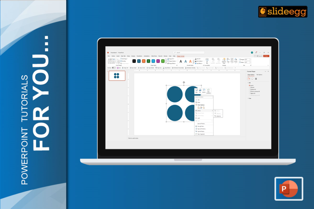
2. Customize the Map
Once you’ve inserted the map, it’s time to customize it to match your presentation’s theme and data:
- Change Colors: Click on the map to select it, then use the “Format” tab to change the fill color, outline color, and other design elements.
- Add Data: To make your map more informative, you can add data labels. Right-click on the map, select “Edit Data,” and enter your data in the spreadsheet that appears.
- Adjust Size and Position: Click and drag the map to resize and position it on your slide. You can also use the alignment tools in the “Format” tab to ensure everything looks neat and tidy.
3. Enhance with Additional Elements
To make your map stand out, consider adding some additional elements:
- Titles and Labels: Use text boxes to add titles, subtitles, and labels to your map. This can help clarify what the map is showing and make it more informative for your audience.
- Icons and Shapes: Insert icons or shapes to highlight specific areas on the map. This is especially useful if you want to draw attention to certain regions or data points.
- Animations: PowerPoint offers a range of animation options that can make your map more dynamic. For example, you can animate different regions of the map to appear sequentially, which can be great for storytelling.
4. Save and Share
Once you’re happy with your map, it’s time to save and share your presentation:
- To save your presentation, navigate to the “File” option in the top menu, and choose “Save As” from the dropdown. Choose a file format that suits your needs (e.g., .pptx, .pdf).
- To share your presentation, you can either send the file directly via email or upload it to a cloud service like OneDrive or Google Drive and share the link.
Tips and Tricks for Creating Effective Maps
- Keep it simple: Maintain clarity by avoiding an overload of details on your map. Emphasize the essential information you want to highlight.
- Use high-quality images: If you’re using images on your map, make sure they are high-resolution and clear.
- Test your map on different devices: Ensure your map looks good on different screen sizes and resolutions.
- Proofread carefully: Check for any spelling or grammatical errors in your map labels and titles.
Want to learn more about creating maps in the Google Slides platform? Check out our guide on “How to Add and Edit Maps in Google Slides“
Conclusion
Creating effective maps in PowerPoint doesn’t have to be complicated. By following these steps and incorporating the tips provided, you can create visually stunning maps that enhance your presentations. And if you want to explore more presentation hacks and tips, visit our tips and tricks page.
Happy map-making!