| Easy Hacks to Make Your Google Slides Look Stunning * Pick a Color Scheme – Stick to 2-3 complementing colors for a cohesive look. * Use Stylish Fonts – Choose modern, readable fonts that match your theme. * Minimal Text, More Visuals – Too much text is overwhelming. Keep it clean! * Use High-Quality Images – Blurry pictures ruin the aesthetic. Stick to HD visuals. * Stay Consistent – Keep fonts, colors, and layout uniform across all slides. * Play with White Space – Don’t overcrowd. Let your design breathe! * Use Creative Layouts – Try grids, overlays, and asymmetry for a modern touch. * Add Subtle Animations – Smooth transitions make slides more engaging. * Align Elements Perfectly – Use guides to keep everything neat and professional. * Use Icons & Illustrations – They add personality and enhance the design. Now, let’s dive deeper! |
How to Make Your Google Slides Aesthetic & Engaging
Imagine sitting through a presentation with dull slides filled with long paragraphs, tiny text, and zero visual appeal. Sounds boring, right? That’s exactly what you want to avoid!
Aesthetic slides don’t just look good—they help communicate your ideas clearly, keep your audience engaged, and make your message more memorable.
Do you know? You don’t need to be a designer to create stunning Google Slides. You just need the right techniques!
Let’s break it down step by step.
1. Pick a Theme or Color Scheme 🎨
Before you start designing, think about the vibe you want. Do you want a modern and minimalistic look? A fun and colorful one? A professional and elegant theme?
- Use color palettes from tools like Coolors or Adobe Color for inspiration.
- Stick to 2-3 main colors to keep your slides looking professional.
- Use contrast wisely – Dark text on a light background (or vice versa) is always best for readability.
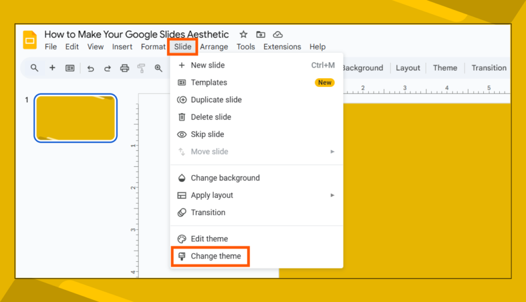
💡 Pro Tip: If you want a pre-made aesthetic theme, Google Slides has built-in templates! Just go to “Slide” > “Change Theme” and pick one.
2. Choose the Right Fonts ✍️
Fonts can make or break your design. The wrong choice can make your slides look messy and unprofessional.
✅ Best font pairings:
- Modern Look: Montserrat + Open Sans
- Elegant Look: Playfair Display + Lora
- Minimal Look: Poppins + Roboto
Avoid too many fonts—stick to one for headings and another for body text. And please, no Comic Sans!
💡 Pro Tip: Use bold fonts for headlines to grab attention and lighter fonts for body text for easy reading.
3. Keep It Simple (Less is More)
Too much text = information overload. Your slides should support your speech, not act as a script.
Is it possible to?
- Use bullet points instead of paragraphs.
- Keep one idea per slide to avoid clutter.
- Leave enough white space (empty space) to give your design a clean, professional feel.
💡 Pro Tip: If your audience needs detailed info, create a separate handout instead of overloading your slides.
4. Use High-Quality Images & Icons 🖼️
Aesthetic slides rely heavily on visuals. But not just any images—high-quality, relevant, and well-placed ones.
Where to get the best visuals?
- Free stock photos: Unsplash, Pexels, Pixabay
- Icons & illustrations: Flaticon, Icons8, Undraw
💡 Pro Tip: Avoid generic stock images. Instead, go for realistic or minimalist illustrations to keep things fresh.
5. Play Around with Layouts 📑
A boring slide is just a title and a big block of text. But a well-designed one uses layout variations to make things interesting.
Try these:
✔ Grid Layout – Neatly arranged elements for a structured look.
✔ Split Screen Layout – Half text, half image for a balanced design.
✔ Overlay Text on Image – Use a semi-transparent background for readability.
✔ Asymmetry – Offset elements slightly for a dynamic look.
💡 Pro Tip: Don’t center everything! Left-aligned text often looks more modern and professional.
6. Add Subtle Animations & Transitions 🎬
Animations add aesthetic appeal and guide attention, but don’t overdo them!
✅ Best transitions & animations:
- Fade In/Out – Smooth and clean.
- Appear – Great for step-by-step points.
- Slide In – Adds a touch of motion without being distracting.
💡 Pro Tip: Avoid crazy effects like spinning text or bouncing images. Keep it classy and minimal.
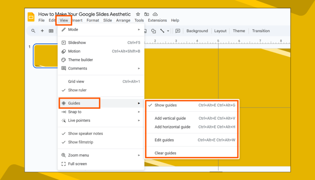
7. Align Everything Perfectly 📏
Messy slides instantly look unprofessional. Aligning elements properly makes them look polished and easier to read.
📌 How to align like a pro:
- Use Google Slides Guides (View > Guides > Add Guides).
- Use the alignment tool (Arrange > Align & Center).
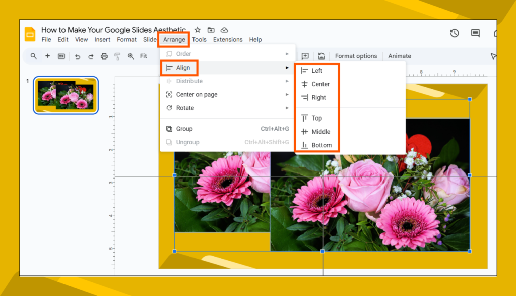
- Keep text left-aligned for better readability.
💡 Pro Tip: Zoom out and view your slides as thumbnails to see if everything looks balanced.
Final Thoughts
Aesthetic Google Slides are more than just “pretty” designs—they help tell a clearer, more engaging story. By choosing the right colors, fonts, layouts, and visuals, you can create slides that stand out and impress your audience.
So next time you make a presentation, ditch the boring slides and use these tips to design something eye-catching and professional!
FAQs
1. How do I make my Google Slides aesthetic in 5 minutes?
Use a pre-made theme, choose a stylish font, stick to a simple layout, add high-quality images, and use clean, subtle animations.
2. What are the best color combinations for aesthetic slides?
- Soft & Minimal: White + Beige + Gold
- Modern & Bold: Black + Yellow + White
- Professional & Clean: Navy Blue + Gray + White
- Fun & Playful: Pastel Pink + Sky Blue + Lavender
3. How many slides should my presentation have?
It depends, but a good rule is one idea per slide. Keep it concise and use more visuals than text.
4. Is it possible to add custom fonts in Google Slides?
Yes! Click Fonts > More Fonts and choose from hundreds of Google Fonts to customize your slides.
5. How do I make my Google Slides look professional?
Use consistent fonts, high-quality images, and a clean layout. Keep your design simple, aligned, and well-spaced.
Got more questions? Drop them below! Let’s make boring presentations a thing of the past.