
Crafting a compelling presentation goes beyond just throwing words on slides. Charts offer a powerful way to showcase data, making your information clear, concise, and visually engaging. But how do you create effective charts in Google Slides? This guide will walk you through the process step-by-step, from choosing the right chart type to customizing it for maximum impact.
Why Charts in Presentations?
Charts are powerful tools for visualizing data in presentations. They help convey information clearly and effectively, making your message more impactful. They translate complex data into easily digestible visuals, boosting audience engagement and comprehension. They can turn numbers into a compelling story, lending credibility to your message.
Choosing the Right Chart Type
Remember to choose the most suitable chart type for your data, keep it clear, and use color effectively to avoid overwhelming your viewers. Here’s a quick breakdown of common chart options available in Google Slides:

- Bar Chart: A bar chart is ideal for comparing different categories. It uses horizontal bars to represent data values.
- Column Chart: Similar to bar charts, column charts use vertical bars to display data. They are great for showing changes over time.
- Line Chart: Line charts are perfect for illustrating trends over a period. They connect data points with lines, making it easy to track progress.
- Pie Chart: Pie charts show the proportions of a whole. Each slice illustrates a category’s contribution to the total.
- Area Chart: An area chart is similar to a line chart but with the area below the line filled in. It’s useful for showing cumulative data.
- Scatter Chart: Scatter charts display individual data points and are helpful for identifying correlations between variables.
- Radial Chart: Radial charts, also known as radar charts, display multi-dimensional data in a circular format. To learn more about creating radial charts, check out our guide on how to make a radial chart in Google Slides.
Step-by-Step Guide to Making Charts in Google Slides
Step 1: Open Google Slides and Create a New Presentation
To start, open Google Slides and create a new presentation. You can do this by navigating to Google Slides (https://www.google.com/slides) and clicking on the “+” button to create a new blank presentation.
Step 2: Insert a Chart
Once your presentation is open, follow these steps to insert a chart:
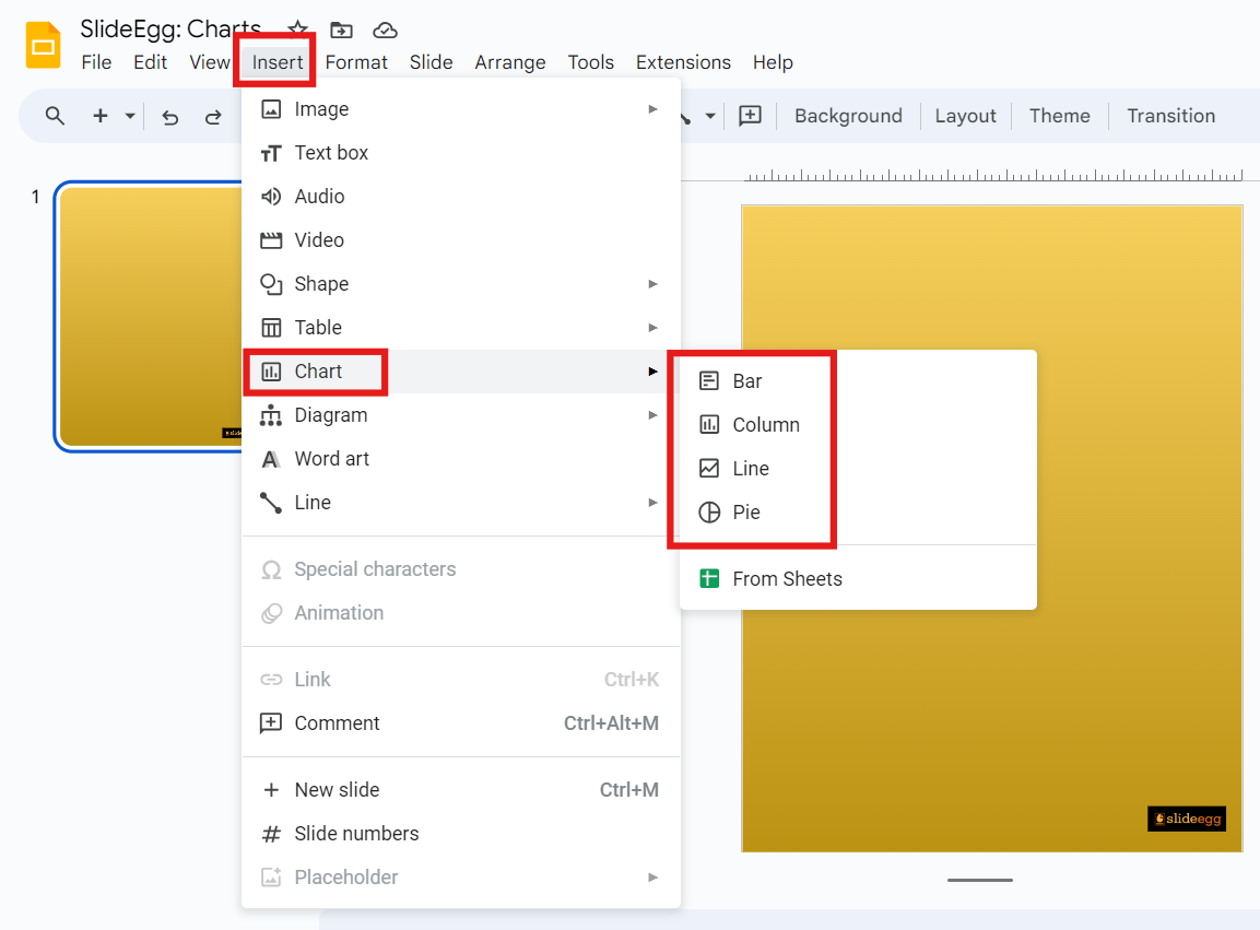
- Click on the “Insert” menu at the top of the screen.
- From the dropdown menu, select “Chart.”
- Choose the type of chart you want to insert.
Step 3: Edit the Chart Data
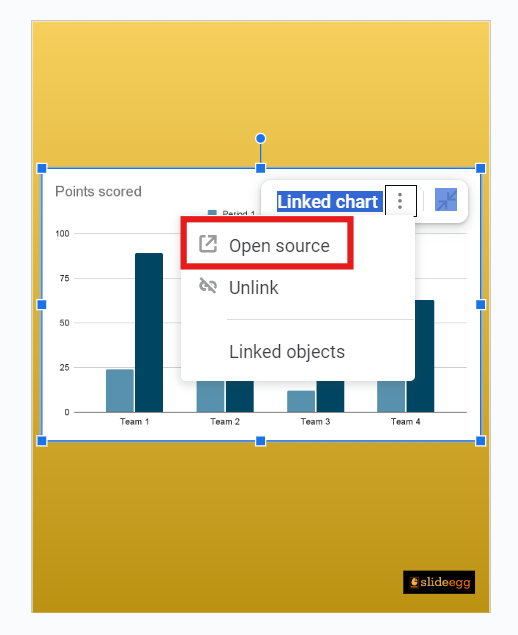
After inserting the chart, you’ll need to edit the data to reflect your information. Here’s how:
- Click on the chart you’ve inserted. A small arrow will appear at the top right corner of the chart.
- Click the arrow and select “Open source.”
- This action will open a linked Google Sheets document where you can input your data.
- Enter your data in the appropriate cells in Google Sheets. As you update the data, the chart in Google Slides will automatically update to reflect these changes.
Step 4: Customize Your Chart
Customizing your chart can make it more visually appealing and tailored to your needs. You can:
- Change Chart Type: If you want to switch to a different chart type, click on the chart and select “Chart type” from the dropdown menu.
- Adjust Colors: Customize the colors of your chart elements by clicking on the chart, selecting the “Customize” tab, and adjusting the color settings.
- Modify Labels: Edit the chart’s labels by clicking on the data points or axes and typing in your new labels.
- Add a Legend: Enhance your chart by adding or modifying the legend. Click on the chart, go to the “Customize” tab, and adjust the legend settings.
Step 5: Integrate Advanced Features
To make your presentation even more engaging, explore advanced features in Google Slides:
- Animations: Add animations to your charts to emphasize key points. Click on the chart, go to “Insert,” then “Animation,” and choose your preferred animation style.
- Transitions: Use slide transitions to create a smooth flow between your slides. Click on the “Slide” menu, select “Change transition,” and pick a transition effect.
Pro Tip: Use Premade Chart Presentation Templates (Optional)
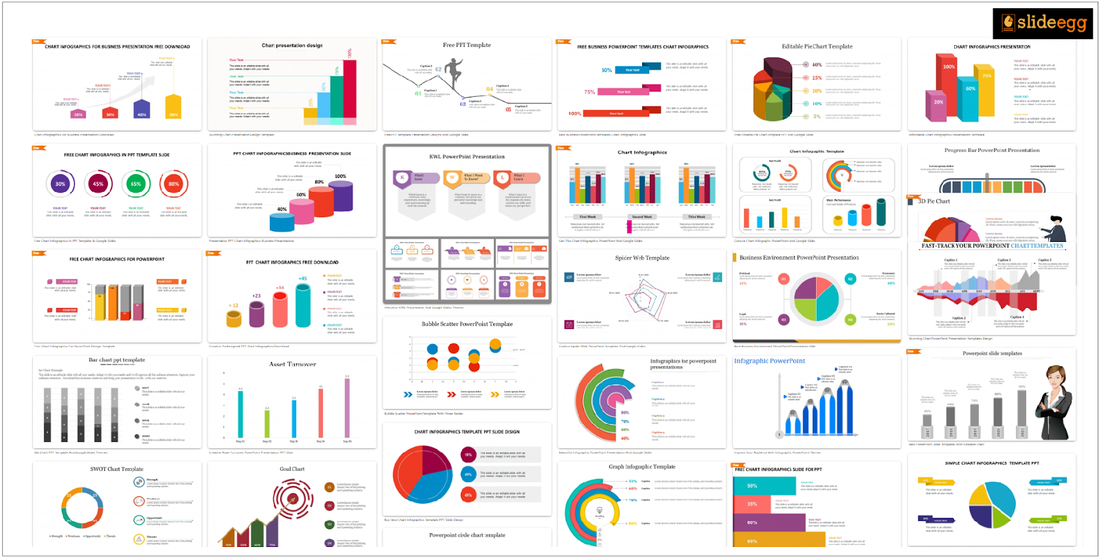
Who says creating a visually appealing presentation has to be time-consuming? By offering pre-designed charts, editable layouts, and a variety of professional styles, ready-made, editable chart presentation templates save you time and effort, enhance communication through visual clarity, and give your presentations a polished look, all at a cost-effective price.
Conclusion
By following these steps and exploring customization options, you can create informative and visually engaging charts that will take your Google Slides templates presentation to the next level. Go forth and chart your way to presentation success! If you’re familiar with Microsoft PowerPoint, you might be interested in learning how to create charts on that platform as well. Check out our informative guide on “How to Make a Chart in PowerPoint” for a seamless transition. Happy presenting!