
Google Slides is a powerful tool for creating presentations, but it also offers a variety of features for visualizing data. One of the most useful features is the ability to create graphs. Graphs can make your data easier to understand and more engaging for your audience. In this blog, we will walk you through the steps to create different types of graphs in Google Slides. This guide is perfect for beginners and those looking to improve their presentation skills.
Why Use Graphs in Google Slides?
Graphs are essential for presenting data in a visually appealing way. They help:
- Simplify complex information
- Highlight trends and patterns
- Make data more engaging
- Enhance the overall quality of your presentation
Types of Graphs You Can Create:
Google Slides allows you to create various types of graphs, including:
- Bar Graphs
- Line Graphs
- Pie Charts
- Area Charts
Each type of graph is suitable for different kinds of data visualization. Let’s explore how to create each one.
Step-by-Step Guide to Making a Graph in Google Slides
Step 1: Open Google Slides
First, open Google Slides in your web browser and create a new presentation or open an existing one.
Step 2: Insert a Chart
To insert a chart:
- Go to the menu bar at the top.
- Click on Insert.
- Select Chart.
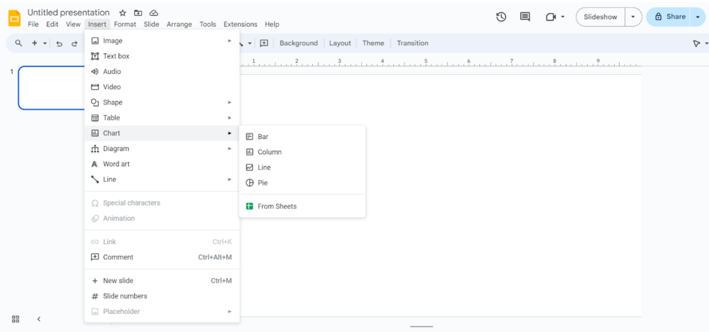
Step 3: Choose the Type of Chart
You will see several options:
- Bar Chart: Best for comparing different categories.
- Column Chart: Similar to bar charts but vertical.
- Line Chart: Ideal for displaying trends over time.
- Pie Chart: Good for showing proportions.
- Area Chart: Useful for displaying cumulative data.
Choose the most suitable chart type for your data.
Step 4: Edit the Chart
Once the chart is inserted, you will see a placeholder chart with sample data. To edit the data:
- Click on the chart.
- Click on the Link icon at the top right corner of the chart.
- Select Open source.
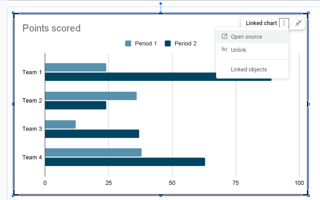
This will open a Google Sheets document where you can enter your data.
Step 5: Enter Your Data
In Google Sheets:
- Replace the sample data with your own.
- Adjust the categories, values, and labels as needed.
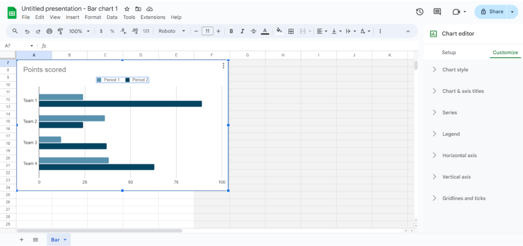
For example, if you are creating a bar chart to show sales data:
- List the product names in the first column.
- Enter the sales figures in the second column.
Step 6: Update the Chart in Google Slides
After entering your data:
- Close the Google Sheets document.
- Go back to Google Slides.
- Click Update on the chart to reflect the changes.
Step 7: Customize the Chart
You can customize the appearance of your chart to match your presentation’s theme:
- Click on the chart.
- Use the formatting toolbar to change colors, fonts, and styles.
- You can also add labels, change the axis titles, and adjust the legend position.
Step 8: Insert Additional Graphs
If you need to insert more graphs:
- Repeat the steps for each new graph.
- Ensure consistency in style and formatting for a cohesive look.
Using Pre-made Google Slides Themes
To enhance the visual appeal of your presentation, consider using pre-made Google Slides themes. These themes are designed by professionals and can save you time while ensuring your presentation looks polished and cohesive. Here’s how to use them:
- Find Pre-made Themes: You can find pre-made templates on various websites.
- Download and Open the Theme: Once you find a theme you like, download the template file and open it in Google Slides.
- Customize the Theme: After opening the theme, replace the sample text and images with your content. Adjust the colors and fonts if needed to match your brand or personal style.
Using a pre-made theme can significantly reduce the time you spend on design, allowing you to focus more on your content.
Tips for Creating Effective Graphs
- Keep It Simple: Avoid cluttering the graph with too much information.
- Use Colors Wisely: Choose contrasting colors to make different data points stand out.
- Label Clearly: Ensure all labels are easy to read and understand.
- Highlight Key Data: Use different styles or colors to emphasize important data points.
Enhance Your Presentation with Infographics
Graphs are just one way to visualize data in Google Slides. For a more dynamic and visually appealing data presentation, you might want to explore infographics. Infographics combine text, images, and data to create a comprehensive and engaging visual. To learn more about how to insert and use infographics in Google Slides, check out our detailed guide.
Conclusion
Creating graphs in Google Slides is a straightforward process that can greatly enhance your presentations. By following these steps, you can effectively visualize your data and engage your audience. Whether you are presenting sales figures, survey results, or any other data, a well-designed graph can make a significant impact.