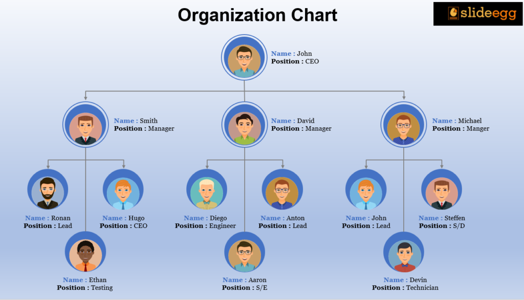
Creating an organizational chart is essential for visualizing the structure of a company, and helping employees understand their roles and relationships within the organization. Google Slides is a free, user-friendly tool that allows you to create professional organizational charts quickly and efficiently. In this guide, we’ll walk you through the steps to create an organizational chart in Google Slides and share some tips for optimizing your presentation.
Understanding Organizational Charts
Before diving into the process, it’s important to understand what an organizational chart is and how it works. An organizational chart visually represents a company’s structure and hierarchy. Whether you’re preparing a business plan, a pitch deck, or a company presentation, an org chart can help viewers understand the relationships within your organization. If you’re new to organizational charts, check out our blog on what is an organizational chart and how it works? to get a comprehensive overview.
Step-by-Step Guide to Creating an Organizational Chart in Google Slides
Using an Organizational Chart Template
Step 1: Open Your Presentation
Begin by opening your Google Slides presentation and selecting the slide where you want to add the organizational chart.
Step 2: Insert a Diagram
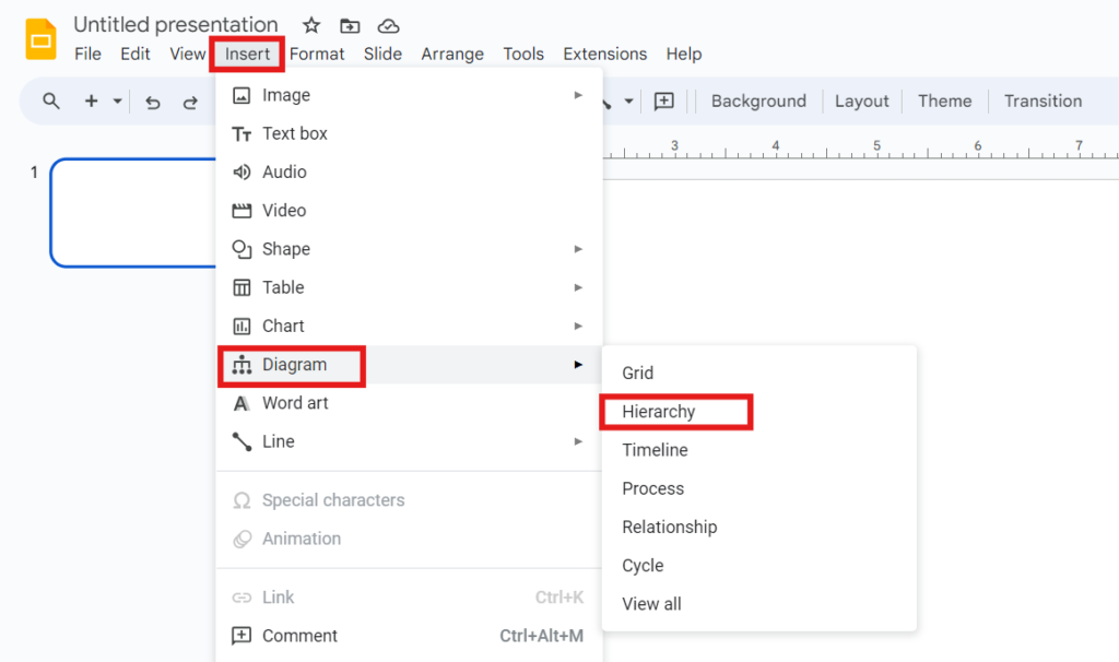
- Click on “Insert” in the menu, then choose “Diagram” from the dropdown.
- A sidebar will appear on the right, showing different diagram categories. Select “Hierarchy”.
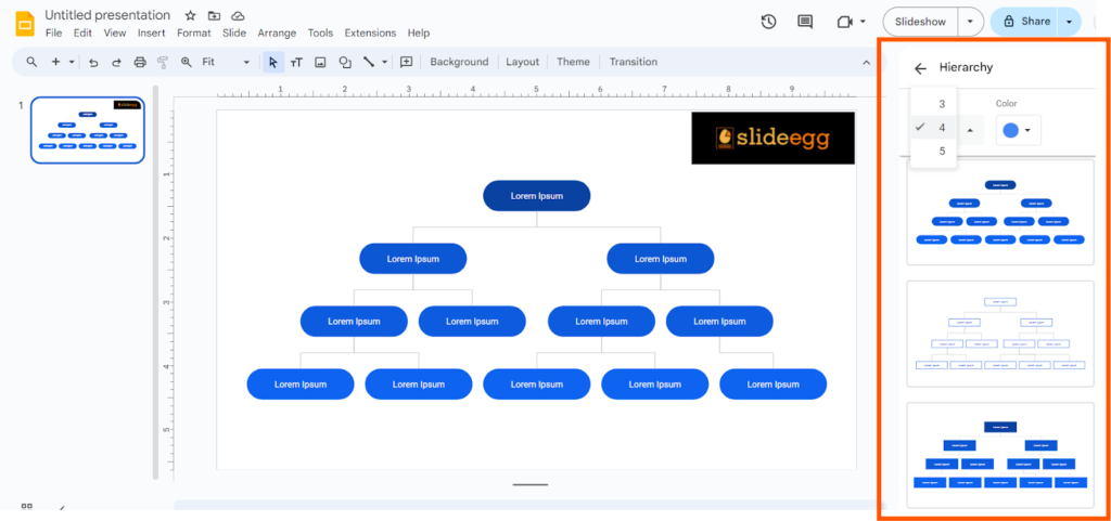
Step 3: Choose the Structure
- Pick the type of structure that best suits your needs (e.g., hierarchical, matrix, or circular).
- Decide how many levels you want your org chart to have.
Step 4: Style the Elements
- Customize the chart by adjusting the Fill color and Border color of each element.
- Maintain consistency with your presentation’s theme colors.
Step 5: Format Texts
- Use options like Font, Font size, and Text color to style the text within the chart.
- Ensure alignment for a visually appealing look.
Creating an Organizational Chart from Scratch
Step 1: Start by Opening Google Slides.
- You can access it directly from your Google Drive or by visiting slides.google.com.
- Click on the “+” button to create a new blank presentation.
Step 2: Choose a Layout
Choose a blank slide layout for a clean slate. This can be done by clicking on the “Layout” button in the toolbar and selecting “Blank”.
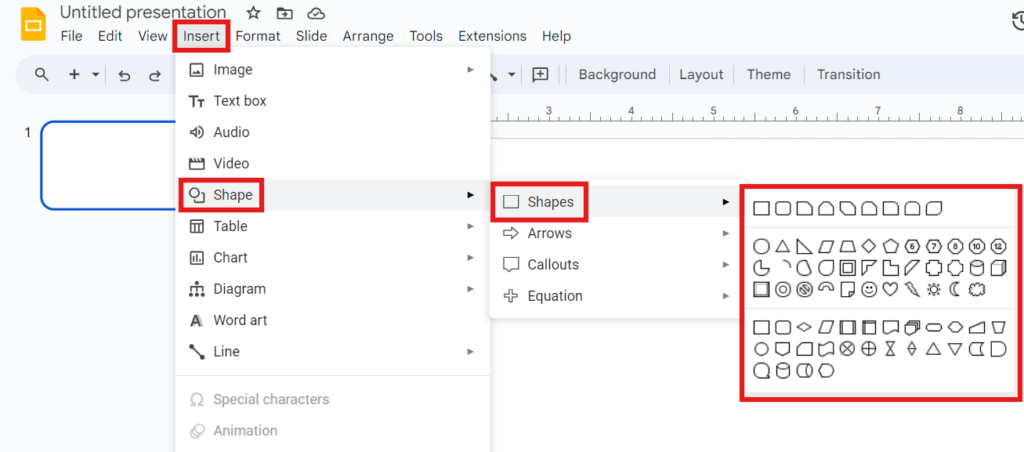
Step 3: Insert a Shape for the Chart
To begin building your chart, you need to insert shapes. Click on the “Insert” menu, select “Shape”, then choose “Rectangle” or any other shape that suits your preference for the chart boxes.
Step 4: Add Text to the Shapes
Click inside the shape to add text. You can include the name, position, and department of the person. Use the toolbar options to format your text.
Step 5: Connect the Shapes
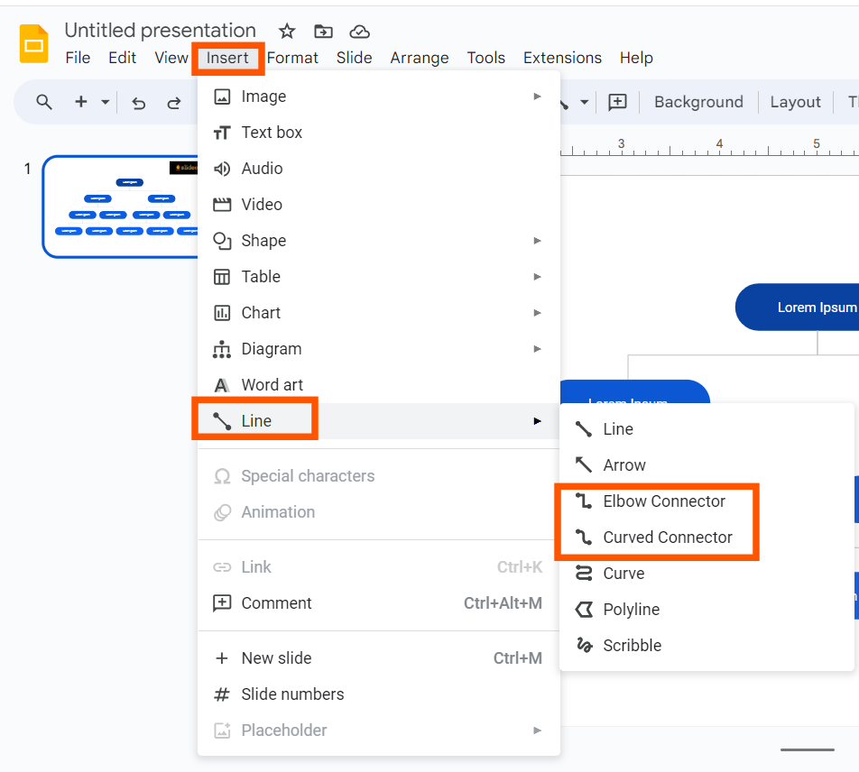
To show the hierarchy, you need to connect the shapes with lines. Click on the “Line” tool in the toolbar, choose “Elbow Connector” or “Curved Connector” for a professional look, and draw lines connecting the shapes.
Step 6: Duplicate Shapes to Add More Levels
To add more boxes, simply copy (Ctrl + C) and paste (Ctrl + V) the existing shape. Adjust the positioning and connect the new shapes with lines.
Using Pre-Made Organizational Chart Templates
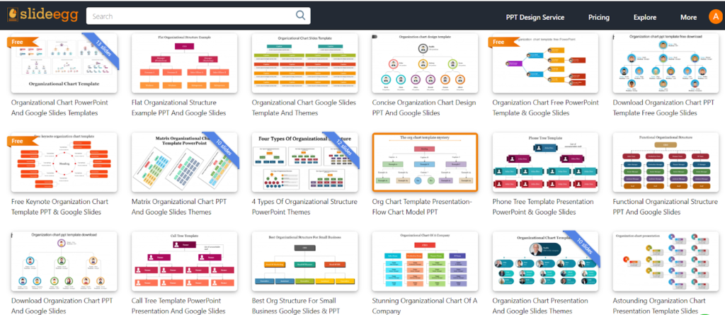
In addition to the built-in diagrams, you can also find a variety of pre-made organizational chart templates available online. These templates can save you time and provide a professional look without much effort. Slide Egg offers a wide range of templates that you can easily customize in Google Slides.
Tips for Enhancing Your Organizational Chart
- Use Consistent Shapes and Sizes: Ensure all shapes in the chart are consistent in size and style to maintain a clean look.
- Color Coding: Use different colors to represent different departments or levels within the organization. This will make the chart clear and easy to understand at a glance.
- Alignment and Spacing: Keep shapes aligned and evenly spaced. Google Slides’ alignment tools can help you achieve this.
- Keep it Simple: Avoid overcrowding the chart with too much information. Focus on the key positions and relationships.
Discover More Presentation Hacks
Creating an effective organizational chart is just one aspect of making a great presentation. For more tips and tricks, visit our tips & tricks page to learn about advanced presentation hacks that can take your slides to the next level.
Conclusion
Creating an organizational chart in Google Slides can be accomplished with a few simple steps. By following this guide, you’ll be well on your way to creating a professional organizational chart that helps clarify roles and responsibilities within your organization. Don’t forget to explore free Google Slides themes online to enhance the visual appeal of your charts, and check out our other resources for more presentation hacks and tips. Start today and make your organizational charts informative and engaging!
