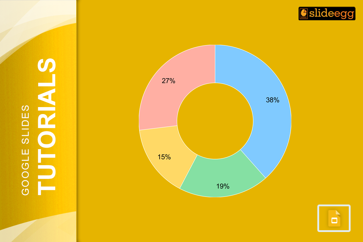
One of the easiest ways to present data on your slides is by making a pie chart. These charts will make it easy for your audience to instantly understand what makes up the information. And the good news is that you don’t need to be an expert in designs or skills to make these charts. It is just one click away! Alright, let’s move forward to learn the simple steps to make your very own pie chart inside Google Slides.
Step 1: Open Google Slides and Choose Your Slide
To start, open up your Google Slides presentation or start a new one. You will need to navigate to the slide where you plan to place your pie chart.
In case you are starting from scratch, then you can avail yourself of some of the free Google Slides templates that are available online, created as pre-made layouts that you can use to make your data pop.
Step 2: Add a Chart
Once you’re on the correct slide, use the following steps:
- Click the “Insert” menu at the top of the page.
- Mouse over “Chart” in the drop-down menu.
- Click on “Pie” from the chart options that appear.
Now, Google Slides will paste a simple pie chart onto your slide for you. But don’t worry. Customizing it to match your data is easy!
Step 3: Change the Chart in Google Sheets
When you first add a pie chart, it will be filled with placeholder data. To make it reflect your own data, you’ll need to do these steps:
- Select pie chart: You will find a small arrow at the top-right corner.
- Click the arrow and select “Open Source.” This will open the chart in Google Sheets.
- Add your data to Google Sheets. The pie chart should update automatically in real time while you are editing.
For instance, if you are creating a pie chart for budget planning, you can insert several values, such as rent, groceries, entertainment, etc. Depending on the inputs you provide, the Google Sheets will automatically update to indicate the share of each input that falls under your data inputs.
Step 4: Make Your Pie Chart Pretty
Alright, now that you’ve set up your data, let’s make this pie chart pretty.
- Change Colors: To change the colors of each slice, simply click on a slice in Google Sheets, then go to the “Format” menu, select “Chart style”, and adjust colors as needed.
- Add Labels: You can add labels in order to know what each slice represents. Under “Customize,” choose “Chart & Axis titles” and add in your title.
- Customize Fonts: With numerous fonts and sizes to choose from, you can easily select a font size combination that will fit your needs in terms of the style of your presentation. Google Slides will make it a breeze to get a chart to match all other slides in your presentation.
These little adjustments can really help your chart stand out, making it easier for your audience to understand your data at a glance.
Step 5: Update Your Slide
That is all the customizations within Google Sheets. Just close Google Sheets. Those modifications you made will update your pie chart in Google Slides automatically. If you want to really perfect and see the final product, you can repeat this process.
Why Use Pie Charts in Presentations?
Pie charts are wonderful if you need to show percentages or proportions. They also give the audience a realistic image of the view and information on what components go proportionate to the whole thing. Want to communicate otherwise with data? Try our tutorial on how to create a radial chart in Google Slides or how to create a chart in PowerPoint to see a few of the other options that may work for your needs.
Wrapping Up
And that’s it! Now you know how to prepare a pie chart within Google Slides — an easy, effective way to show the data. Don’t forget to play around with colors, labels, and free templates to make your charts even more attractive and professional. Pie charts are actually a game-changer for presentations, giving your audience a clear and quick understanding of the data you present. Have fun creating, and good luck with your presentation!


